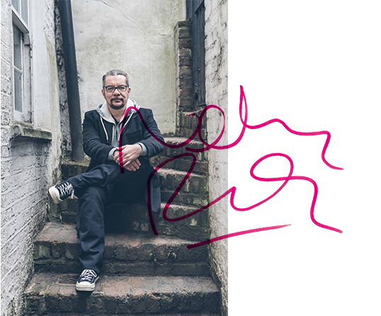
Typeset in Brody Associates Headline Regular. © 2020 Brody Associates.

Brody Associates is a London-based design studio specializing in identity, typography, and creative direction across all platforms. Founded by Neville Brody in 2014, we collaborate with the world’s biggest brands, celebrated institutions, and dynamic start-ups.

Inspired by the company’s archive, Brody Associates’ type design strategy blended Coca-Cola’s rich font heritage with its modern-day use requirements, bringing another layer of storytelling to the brand through typography. “Better with…” comes in both a wide and narrow style. Used together they bring unique personality, movement, and playfulness to marketing and communications during the 2023 holiday season.

客户: Coca-Cola
项目: “Better With…” Typeface (Holidays 23 Edition)
专业服务: typography
版权所有: © 2023 The Coca-Cola Company
1/8

Neville Brody’s much awaited third monograph has arrived! The Graphic Language of Neville Brody 3 (NB3) is available online and through selected retailers. Written by Neville and edited by Adrian Shaugnessy, the book includes a foreword by Steve Heller and additional text by Naomi Hirabayashi and Jo-Ann Furniss. NB3 is a visual explosion, showcasing work from the last 30 years of Neville’s career, experimentation, and his passion for design. Receive a 30% discount using the code NB330.

客户:
项目: NB3
专业服务:
版权所有:
1/10
客户:
项目:
专业服务:
版权所有:
客户:
项目:
专业服务:
版权所有:
1/11

Inspired by the golden age of Americana type and in the playful spirit of the original 1940s Baskin Robbins experience, Brody Associates created BRK Sans, a modern, playful, and “creamy” typeface for the company’s South Korean franchise. A versatile single style and multiple weights were created to bring expression across all of the brand’s touchpoints.

客户: SPC
项目: BKR Sans
专业服务: typography
版权所有: Paris Croissant Co., Ltd.
1/10

Founded in 1971 as Britain’s first public gallery dedicated to photography, The Photographers’ Gallery (TPG) wanted an engaging campaign identity for its 50th anniversary. TPG 50 locked together a celebratory moiré effect stamp which worked alongside the existing identity and broke out into its own graphic language to tie together platforms, experiences, and events.

客户: The Photographers’ Gallery
项目: TPG 50
专业服务: campaign identity and typography
版权所有: The Photographers’ Gallery – Registered Charity Number: 262548
1/8

Union Square & Co., part of America’s Barnes & Noble, publishes a diverse collection of genres – from fiction and food titles to mindfulness and children’s books. Brody Associates created a central brand identity, visual language system and a new typeface family to bring consistency to this variety of imprints. The toolkit and application systems enabled the brand to scale iconically across touchpoints.

客户: Barnes & Noble
项目: Union Square & Co Brand Identity Guidelines
专业服务: brand identity and typography
版权所有: Union Square & Co., LLC.
1/11

Mayo Clinic is one of the most recognized and respected healthcare, medical research, and educational institutions in the USA. Brody Associates was asked to create a bespoke typeface, Mayo Clinic, across display, serif, and sans serif font styles as part of the brand development process. This led into the adaptation of core brand identity elements.

客户: Mayo Clinic
项目: Brand Identity Refinement and Mayo Clinic Typeface
专业服务: Brand identity, typography, and creative direction
版权所有: Mayo Clinic
1/9
客户: L'Occitane
项目: L'Occitane Serif and L'Occitane Sans Typeface
专业服务: typography and creative direction
版权所有: © L'Occitane en Provence, 2022
客户: L'Occitane
项目: L'Occitane Serif and L'Occitane Sans Typeface
专业服务: typography and creative direction
版权所有: © L'Occitane en Provence, 2022
1/11

Brody Associates created the first proprietary typefaces for luxury Swiss watchmaker Longines, blending references from its archive with contemporary design precision and functionality. We delivered the typeface for use in headline, text, and italics in both serif and sans serif font styles. The typeface was mastered in different weights for all touchpoints and in major Western and Central European languages.

客户: Longines
项目: Longines Typeface
专业服务: typography and type direction
版权所有: Longines Watch Co. Francillon Ltd.
1/12

TC TEN celebrates 10 years of future thinking for the now iconic Turner Contemporary in Margate (UK). Brody Associates created the anniversary identity which brings together the institutions initials and anniversary into a bespoke wordmark to connect with the existing brand identity in a vibrant, playful and scalable way.

客户: Turner Contemporary
项目: TC Ten (10th Anniversary)
专业服务: brand identity, typography and creative direction
版权所有: Turner Contemporary
1/7

For the first time in their 150-year history, SHISEIDO, the iconic Japanese skincare, make-up, and fragrance brand, decided to commission a company-wide unifying communication strategy. Brody Associates was entrusted to develop and build the global organization’s first brand code, one that aligned its strategy and narrative with its creative and application principles across product lines, territories, and platforms.

客户: SHISEIDO
项目: SHISEIDO Brand Code
专业服务: brand identity and creative direction
版权所有: SHISEIDO Co., Ltd.
1/8

Brody Associates 受托帮助日本最成功的职业足球队 Tokyo Verdy 通过创造新的品牌标志、字体和视觉语言来传达对未来的愿景。新的品牌标志、字体和视觉语言将其他运动和活动融入,共同庆祝该品牌的传承和成长。


客户: Tokyo Verdy 品牌标志
项目: Tokyo Verdy Brand Identity
专业服务: 品牌标志、字体版式和创意指导
版权所有: Amadana Sports Entertainment Corp.

Brody Associates 受托帮助日本最成功的职业足球队 Tokyo Verdy 通过创造新的品牌标志、字体和视觉语言来传达对未来的愿景。新的品牌标志、字体和视觉语言将其他运动和活动融入,共同庆祝该品牌的传承和成长。


客户: Tokyo Verdy 品牌标志
项目: Tokyo Verdy Brand Identity
专业服务: 品牌标志、字体版式和创意指导
版权所有: Amadana Sports Entertainment Corp.
1/9

Brody Associates 受托改进 ASICSOnitsuka Tiger 标识,确保其不是重新设计的而是改进的,不仅提高其美学吸引力,而且在不同的环境中和平台上更实用。

客户: ASICS
项目: Onitsuka Tiger (鬼塚虎)标识改进
专业服务: 字体版式
版权所有: ASICS Corporation/Drill Inc.

Brody Associates 受托改进 ASICSOnitsuka Tiger 标识,确保其不是重新设计的而是改进的,不仅提高其美学吸引力,而且在不同的环境中和平台上更实用。

客户: ASICS
项目: Onitsuka Tiger (鬼塚虎)标识改进
专业服务: 字体版式
版权所有: ASICS Corporation/Drill Inc.
1/6

Brody Associates为Christian Dior改进的标志看似简单,但是既保留了其标志性特征和尊贵定位又在应用中高度实用。我们将这个标志设计成具有可互换的纵轴的连接设计,从而可以将其用作单个标志或组件。

客户: LVMH(路易·威登)
项目: Christian Dior Marque(克里斯汀·迪奥)
专业服务: 品牌标志和字体设计
版权所有: LVMH

Brody Associates为Christian Dior改进的标志看似简单,但是既保留了其标志性特征和尊贵定位又在应用中高度实用。我们将这个标志设计成具有可互换的纵轴的连接设计,从而可以将其用作单个标志或组件。

客户: LVMH(路易·威登)
项目: Christian Dior Marque(克里斯汀·迪奥)
专业服务: 品牌标志和字体设计
版权所有: LVMH
1/5

Samsung的所有平台上、产品中和地区带来相同的体验是一项挑战。Samsung委托Brody Associates设计和创意指导了SamsungOne字体系列。这个字体系列在任何环境中在任何缩放比例下均可发挥独特的作用,涵盖400多种语言和26种书写系统。

客户: Samsung Electronics(三星电子)
项目: SamsungOne 字体
专业服务: 字体版式和创意指导
版权所有: Samsung Electronics Co., Ltd.

Samsung的所有平台上、产品中和地区带来相同的体验是一项挑战。Samsung委托Brody Associates设计和创意指导了SamsungOne字体系列。这个字体系列在任何环境中在任何缩放比例下均可发挥独特的作用,涵盖400多种语言和26种书写系统。

客户: Samsung Electronics(三星电子)
项目: SamsungOne 字体
专业服务: 字体版式和创意指导
版权所有: Samsung Electronics Co., Ltd.
1/7

回顾Neville Brody的字体版式作品,Brody Associates为Supreme的胶囊系列设计了新的口号、行动号召和图形标识。

客户: Supreme
项目: Nevile Brody for Supreme
专业服务: 字体版式和创意指导
版权所有: Supreme

回顾Neville Brody的字体版式作品,Brody Associates为Supreme的胶囊系列设计了新的口号、行动号召和图形标识。

客户: Supreme
项目: Nevile Brody for Supreme
专业服务: 字体版式和创意指导
版权所有: Supreme
1/6

SPC came to Brody Associates to bring a more contemporary sense of playfulness and movement across their Dunkin’ Donuts franchise touchpoints, from packaging and in-store to digital platforms. The resulting creative direction dynamically combined scaled type, bold forms, patterns, color, and motion.

客户: SPC
项目: Dunkin’ Donuts Graphics
专业服务: creative direction
版权所有: Paris Croissant Co., Ltd.
1/8

Mayo Clinic是美国最受认可和推崇的医疗保健、医学研究和教育机构之一。作为品牌发展过程的一部分,Mayo Clinic 委托Brody Associates设计了定制字体Mayo Clinic,包含显示字体、衬线字体和无衬线字体三种样式。该字体主导了核心品牌标志元素的改编。


客户: Mayo Clinic(梅奥诊所)
项目: 品牌标志优化和Mayo Clinic字体
专业服务: 品牌标志、字体版式和创意指导
版权所有: Mayo Clinic

Mayo Clinic是美国最受认可和推崇的医疗保健、医学研究和教育机构之一。作为品牌发展过程的一部分,Mayo Clinic 委托Brody Associates设计了定制字体Mayo Clinic,包含显示字体、衬线字体和无衬线字体三种样式。该字体主导了核心品牌标志元素的改编。


客户: Mayo Clinic(梅奥诊所)
项目: 品牌标志优化和Mayo Clinic字体
专业服务: 品牌标志、字体版式和创意指导
版权所有: Mayo Clinic
1/10

Channel 4请Brody Associates设计了Horseferry——一种非常独特、辨识度高的显示字体,作为其更新标识的关键一部分使用在所有频道和内容中。作为该字体的补充和配合,我们还开发了功能强大、信息感强的字体Chadwick

客户: Channel 4(第四频道)
项目: Chadwick 和 Horseferry 字体
专业服务: 字体排版设计
版权所有: Channel Four Television Corporation(第四频道电视公司)

Channel 4请Brody Associates设计了Horseferry——一种非常独特、辨识度高的显示字体,作为其更新标识的关键一部分使用在所有频道和内容中。作为该字体的补充和配合,我们还开发了功能强大、信息感强的字体Chadwick

客户: Channel 4(第四频道)
项目: Chadwick 和 Horseferry 字体
专业服务: 字体排版设计
版权所有: Channel Four Television Corporation(第四频道电视公司)
1/8

RCA在伦敦怀特城开设了一个校区,请Brody Associates设计一套标志着它来到这个新场所的标牌系统,创造出醒目的空间标志和形象。为了实现这一目标,我们使用了缩放和定制字体Calvert Brody——这是Neville Brody与著名设计师和版式师Margaret Calvert联袂设计的。

客户: Royal College of Art (RCA)
项目: 怀特城(White City)环境品牌塑造
专业服务: 字体版式和创意指导
版权所有: Royal College of Art

RCA在伦敦怀特城开设了一个校区,请Brody Associates设计一套标志着它来到这个新场所的标牌系统,创造出醒目的空间标志和形象。为了实现这一目标,我们使用了缩放和定制字体Calvert Brody——这是Neville Brody与著名设计师和版式师Margaret Calvert联袂设计的。

客户: Royal College of Art (RCA)
项目: 怀特城(White City)环境品牌塑造
专业服务: 字体版式和创意指导
版权所有: Royal College of Art
1/7

Brody Associates为尼康摄影大赛创造了品牌标志和视觉语言,用直角为世界最有影响力之一的摄影比赛注入活力和能量。通过运用尼康黄等标志性元素,我们在比赛标志和企业形象之间建立联系。

客户: Nikon(尼康)
项目: Nikon Photo Contest(尼康摄影大赛)品牌标志
专业服务: 品牌标志和创意指导
版权所有: Nikon Corporation(尼康株式会社)/ Plus Eight One

Brody Associates为尼康摄影大赛创造了品牌标志和视觉语言,用直角为世界最有影响力之一的摄影比赛注入活力和能量。通过运用尼康黄等标志性元素,我们在比赛标志和企业形象之间建立联系。

客户: Nikon(尼康)
项目: Nikon Photo Contest(尼康摄影大赛)品牌标志
专业服务: 品牌标志和创意指导
版权所有: Nikon Corporation(尼康株式会社)/ Plus Eight One
1/5

在设计地下激进杂志和实验杂志 Vandals 时,Brody Associates 探索了新型创意方向和排版以及字体和图像之间的关系。通过将这一点跟杂志内容结合起来,令 Vandals 不仅是一本出版物,更是独特而具有激发性的艺术品。

客户: Vandals
项目: Vandals 杂志
专业服务: 创意指导
版权所有: WE ARE VANDALS

在设计地下激进杂志和实验杂志 Vandals 时,Brody Associates 探索了新型创意方向和排版以及字体和图像之间的关系。通过将这一点跟杂志内容结合起来,令 Vandals 不仅是一本出版物,更是独特而具有激发性的艺术品。

客户: Vandals
项目: Vandals 杂志
专业服务: 创意指导
版权所有: WE ARE VANDALS
1/8

为了庆祝皇家特许状颁发180周年,RCA请Brody Associates设计一套可扩展且动态的品牌字体标志,以在所有平台上独树一帜。

客户: Royal College of Art (RCA)
项目: 皇家艺术学院180周年标志
专业服务: 品牌标志和字体版式
版权所有: Royal College of Art

为了庆祝皇家特许状颁发180周年,RCA请Brody Associates设计一套可扩展且动态的品牌字体标志,以在所有平台上独树一帜。

客户: Royal College of Art (RCA)
项目: 皇家艺术学院180周年标志
专业服务: 品牌标志和字体版式
版权所有: Royal College of Art
1/6

韩国企业集团SPC旗下最大的快速消费品特许经营品牌Paris Baguette当时在其国内市场已经成熟,并且正在迅速向国际扩张。Brody Associates受托开发新的品牌标志,定制字体PB Signature,并在创意方面指导新的跨平台视觉语言。

客户: SPC
项目: Paris Baguette(巴黎贝甜)品牌标志
专业服务: 品牌标志、字体版式和创意指导
版权所有: Paris Croissant Co., Ltd.

韩国企业集团SPC旗下最大的快速消费品特许经营品牌Paris Baguette当时在其国内市场已经成熟,并且正在迅速向国际扩张。Brody Associates受托开发新的品牌标志,定制字体PB Signature,并在创意方面指导新的跨平台视觉语言。

客户: SPC
项目: Paris Baguette(巴黎贝甜)品牌标志
专业服务: 品牌标志、字体版式和创意指导
版权所有: Paris Croissant Co., Ltd.
1/9

Brody Associates为 The Coca-Cola Company创造了第一个专有字体,该字体现已应用于品牌和公司。除了强大的功能之外,我们还根据构成我们广泛档案研究一部分的字体特征塑造了TCCC Unity 的字体个性。


客户: The Coca-Cola Company(可口可乐公司)
项目: TCCC Unity 字体项目
专业服务: 字体排版设计
版权所有: The Coca-Cola Company

Brody Associates为 The Coca-Cola Company创造了第一个专有字体,该字体现已应用于品牌和公司。除了强大的功能之外,我们还根据构成我们广泛档案研究一部分的字体特征塑造了TCCC Unity 的字体个性。


客户: The Coca-Cola Company(可口可乐公司)
项目: TCCC Unity 字体项目
专业服务: 字体排版设计
版权所有: The Coca-Cola Company
1/7

由于设计了“2014年国际足联英格兰世界杯赛服”(2014 FIFA England World Cup kit) 字体,Brody Associates获得 Nike Football 授予的殊荣。England Brody由显示数字和功能字母字符组成,首次将个性和表现力融入男性赛服,随后又设计了女性赛服和21岁以下人士的赛服。

客户: Nike
项目: England Brody 字体
专业服务: 字体设计
版权所有: Nike, Inc.

由于设计了“2014年国际足联英格兰世界杯赛服”(2014 FIFA England World Cup kit) 字体,Brody Associates获得 Nike Football 授予的殊荣。England Brody由显示数字和功能字母字符组成,首次将个性和表现力融入男性赛服,随后又设计了女性赛服和21岁以下人士的赛服。

客户: Nike
项目: England Brody 字体
专业服务: 字体设计
版权所有: Nike, Inc.
1/6

作为首个“The Ten”系列启动的一部分,Nike Virgil Abloh 请 Brody Associates 在创意方面指导并举办伦敦“OFF CAMPUS”活动的工作坊。我们着重与年轻创意者合作,一起重新打造摩登时代的独立杂志,向他们介绍从未体验过的技能。

客户: Nike(耐克)
项目: Nike联合Virgil Abloh(维吉尔·阿布洛)的“OFF CAMPUS”伦敦
专业服务: 创意指导
版权所有: Nike, Inc.(耐克公司)

作为首个“The Ten”系列启动的一部分,Nike Virgil Abloh 请 Brody Associates 在创意方面指导并举办伦敦“OFF CAMPUS”活动的工作坊。我们着重与年轻创意者合作,一起重新打造摩登时代的独立杂志,向他们介绍从未体验过的技能。

客户: Nike(耐克)
项目: Nike联合Virgil Abloh(维吉尔·阿布洛)的“OFF CAMPUS”伦敦
专业服务: 创意指导
版权所有: Nike, Inc.(耐克公司)
1/6

Brody Associates 遵循 Tate Modern 的核心理念“实验表演和现场参与”,在创意方面指导设计了一本书和配套的人工智能应用程序,将内容的表现力展现得淋漓尽致。我们还设计了 Buffalo Mono 这一字体——它是视觉语言的一部分。

客户: Tate Public Programmes
项目: BMW Tate Live: Perform, Experience, Re-Live(宝马泰特直播:表演、体验、重生)
专业服务: 版式和创意指导
版权所有: Tate Modern(泰特现代美术馆)

Brody Associates 遵循 Tate Modern 的核心理念“实验表演和现场参与”,在创意方面指导设计了一本书和配套的人工智能应用程序,将内容的表现力展现得淋漓尽致。我们还设计了 Buffalo Mono 这一字体——它是视觉语言的一部分。

客户: Tate Public Programmes
项目: BMW Tate Live: Perform, Experience, Re-Live(宝马泰特直播:表演、体验、重生)
专业服务: 版式和创意指导
版权所有: Tate Modern(泰特现代美术馆)
1/8

Brody Associates 受托将 Dom Pérignon 这家享有盛名的香槟酒庄的古老产品的核心品牌标志和视觉语言合理化、现代化和简约化。除此之外,我们还发起并创造了一个全新的包装体系;该体系既可用于店内展示,也可作为豪华包装盒使用。

客户: LVMH
项目: Dom Pérignon(唐培里侬香槟王)古典品牌标志开发和包装设计
专业服务: 品牌标志和创意指导
版权所有: LVMH

Brody Associates 受托将 Dom Pérignon 这家享有盛名的香槟酒庄的古老产品的核心品牌标志和视觉语言合理化、现代化和简约化。除此之外,我们还发起并创造了一个全新的包装体系;该体系既可用于店内展示,也可作为豪华包装盒使用。

客户: LVMH
项目: Dom Pérignon(唐培里侬香槟王)古典品牌标志开发和包装设计
专业服务: 品牌标志和创意指导
版权所有: LVMH
1/3

Samsung 委托 Brody Associates 全面优化其家用电器事业部的图标语言。我们根据用来描述各种品牌元素的词语创造了一个视觉词典。随后,我们将这个视觉词典转换为令人惊叹的设计系统,以在印刷和数字化环境中实现最佳表现力,而且我们的应用指导手册能确保该系统能够适应未来的需求。

客户: Samsung图标
项目: Samsung Icons
专业服务: 品牌标志
版权所有: Samsung Electronics Co., Ltd.

Samsung 委托 Brody Associates 全面优化其家用电器事业部的图标语言。我们根据用来描述各种品牌元素的词语创造了一个视觉词典。随后,我们将这个视觉词典转换为令人惊叹的设计系统,以在印刷和数字化环境中实现最佳表现力,而且我们的应用指导手册能确保该系统能够适应未来的需求。

客户: Samsung图标
项目: Samsung Icons
专业服务: 品牌标志
版权所有: Samsung Electronics Co., Ltd.
1/5

Balfron Tower 是东伦敦的标志性野兽派建筑,由Ernő Goldfinger设计。作为 Londonewcastle 再开发此建筑的一部分,Brody Associates受托设计了品牌标志、Balfron Modern 字体和视觉语言,并在创意方面指导该项目以当代方式展现建筑的传统品质。

客户: Londonewcastle
项目: Balfron Tower 品牌标志
专业服务: 品牌标志、字体版式和创意指导
版权所有: Balfron Tower Development LLP 联合 Londonewcastle

Balfron Tower 是东伦敦的标志性野兽派建筑,由Ernő Goldfinger设计。作为 Londonewcastle 再开发此建筑的一部分,Brody Associates受托设计了品牌标志、Balfron Modern 字体和视觉语言,并在创意方面指导该项目以当代方式展现建筑的传统品质。

客户: Londonewcastle
项目: Balfron Tower 品牌标志
专业服务: 品牌标志、字体版式和创意指导
版权所有: Balfron Tower Development LLP 联合 Londonewcastle
1/8

韩国快速消费品集团 SPC 请Brody Associates全面优化其现有的 Coffee@Works 概念并提升其品牌形象。我们基于凸版印刷的特点创造了一种动感而现代的标志,并在创意方面指导了配套视觉语言。

客户: SPC
项目: Coffee@Works 标志
专业服务: 品牌标志和创意指导
版权所有: Paris Croissant Co., Ltd.

韩国快速消费品集团 SPC 请Brody Associates全面优化其现有的 Coffee@Works 概念并提升其品牌形象。我们基于凸版印刷的特点创造了一种动感而现代的标志,并在创意方面指导了配套视觉语言。

客户: SPC
项目: Coffee@Works 标志
专业服务: 品牌标志和创意指导
版权所有: Paris Croissant Co., Ltd.
1/6

For more information about Brody Associates, click here.

If you would like to get in touch, please contact us at:

hello@brody-associates.com +44 (0) 207 704 2445

关于Neville Brody

Neville Brody是“视觉语言”的代名词。他是一位具有开创性的创意总监、设计师、字体版式师和品牌战略家,凭借跨越了四十年的大量作品享誉全球。他以突破设计界限和锐意创新而闻名。正是这种探索和追求卓越的精神奠定了Brody Associates的目标。

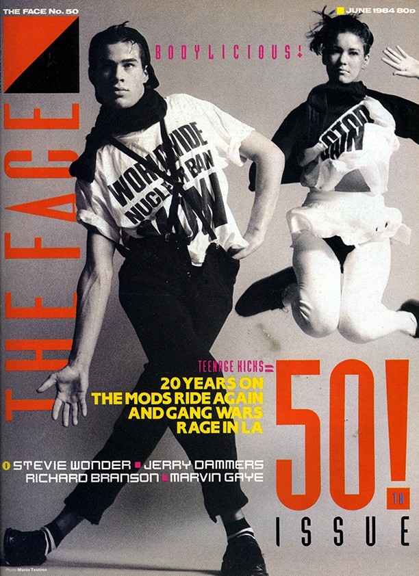
他一直是一位亲力亲为的创意总监和设计师。自20世纪70年代末从London College of Printing(伦敦印刷学院,现为London College of Communication——伦敦传媒学院)毕业后,他通过为朋克乐队设计唱片封套而声名鹊起。20世纪80年代,他在The Face and Arena中担任艺术总监的工作为他赢得了国际声誉。自20世纪90年代末以来,Brody已为英国最著名的艺术和文化品牌(包括BBC、The Times(《泰晤士报》)、Somerset House(萨默塞特宫)、皇家艺术学院、Tate和Channel 4)创作了开创性的作品。

TheFace.1.jpg#asset:539

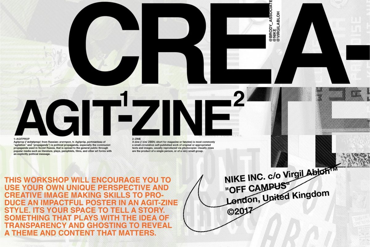
现在,他领导着Brody Associates团队,仍然从概念到完成始终热忱地参与我们的项目。除了与英国品牌和企业保持紧密联系外,Brody最近的许多作品都是为全球巨头(包括Samsung、Yamaha(雅马哈)、LVMH、GAP(盖璞)、Uniqlo(优衣库)、The Coca-Cola Company、Nike和NIKON】服务的。

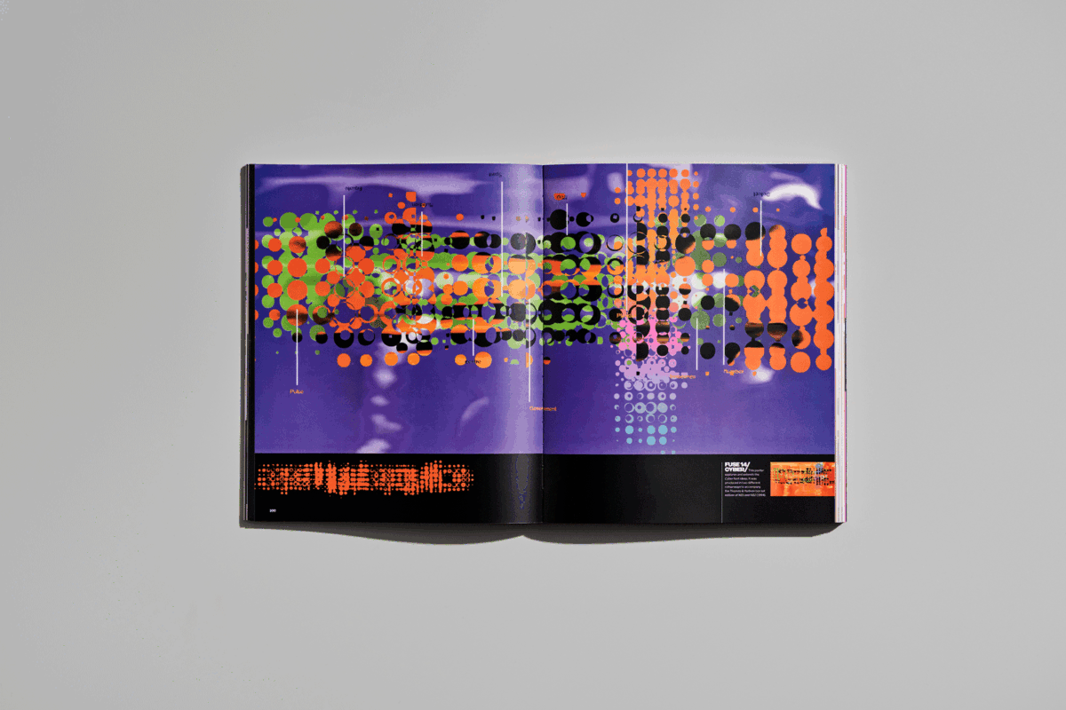
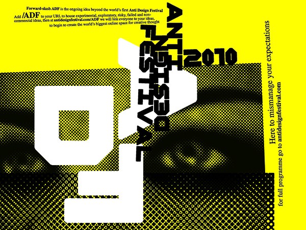
Brody通过他的工作和新项目的传播积极挑战对创造力的感知。1991年,怀着对字体的热爱,他创立了FUSE——一份以最彻底和实验性的方式分享和庆祝艺术形式的出版物。他还于2011年在伦敦发起了Anti-Design Festival (ADF)(反设计节),以探索跨设计学科的新思想和新媒介并挑战当代设计界。

ADF.jpg#asset:515

他对设计的杰出贡献已得到许多行业机构和组织的认可,包括Brody于2011年被授予的英国最高设计荣誉“皇家工业设计师”(RDI)和于2010年获得的“菲利普亲王设计师奖特别表彰”(Special Commendation in the Prince Philip Designers Prize)。在全世界收藏Brody作品的各类美术馆、博物馆和图书馆中,他于1991年设计的字体Blur是纽约现代艺术博物馆的永久收藏品。

Brody对创意教育同样充满热情,目前是位于伦敦的皇家艺术学院视觉传达系的教授。在2012年至2013年担任英国设计和艺术指导协会(D&AD UK)理事一职时,他增进了全球对创意教育面临的未来挑战的认识,并主张了行业支持和变革的需要。他多次在国际上演讲,为行业发声,支持设计教育并为下一代创造机会

Neville_Signature_3.png#asset:521

对Brody而言,任何设计背后的思考和过程都和结果一样迷人且重要,这也正是他在工作室内部不断采用和鼓励的理念。

关于Brody Associates

我们的工作方式是讲究技艺的、基于知识的、战略性的和高度创新的。客户与设计师之间的直接沟通确保我们的团队从受委托到项目完成始终紧密参与。

每个项目均配备内部项目管理、行政管理和客服支持,以确保项目的按时进展和预算的有效控制。我们根据项目的特质和目标将精心挑选、灵活且高效的团队召集在一起。团队的成员们风度翩翩、技术过硬、富有创造力、满怀热情,各自发挥在相应领域的专长。我们发现客户喜欢以这种方式合作,并且明白这会带来不俗的成果。

This page was automatically translated according to your browser language settings.

Acknowledge
Read in English