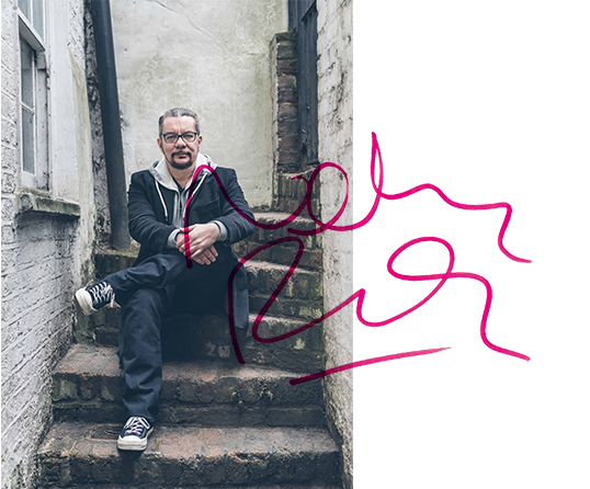
Typeset in L'Occitane Serif created for L'Occitane en Provence ©2021 L’Occitane International SA.

Brody Associates is a London-based design studio specializing in identity, typography, and creative direction across all platforms. Founded by Neville Brody in 2014, we collaborate with the world’s biggest brands, celebrated institutions, and dynamic start-ups.

Following a major audit, we evolved the Royal College of Art’s brand identity guidelines (created by Brody Associates in 2012) to provide clarity around brand components, ensure accessibility at all levels, and future-proof them for digital, rich media, and social needs. The result was a scaled BI system suitable for a global university. Highly practical and efficient to apply, it also allowed individuality and creativity to flourish.

고객: Royal College of Arts
프로젝트: RCA Brand Identity Guidelines
전문 분야: Branding, Identity
크레딧: Royal College of Arts 2024
1/10

The Nikon Photo Contest has been running since 1969. In 2024, it evolved to embrace new perspectives, including an expanded film category. We developed a fresh brand identity and visual language to support the transformation, building in motion to engage audiences and help them see things from a different angle.

 Contemporary and flexible, the new toolkit was made to suit screen and digital environments, while reflecting entrants’ rich content.

고객: Nikon
프로젝트: Nikon Film & Photo Contest
전문 분야: Brand Identity and Visual Language
크레딧: Nikon Corporation
1/9

Inspired by the company’s archive, Brody Associates’ type design strategy blended Coca-Cola’s rich font heritage with its modern-day use requirements, bringing another layer of storytelling to the brand through typography. “Better with…” comes in both a wide and narrow style. Used together they bring unique personality, movement, and playfulness to marketing and communications during the 2023 holiday season.

고객: Coca-Cola
프로젝트: “Better With…” Typeface (Holidays 23 Edition)
전문 분야: typography
크레딧: © 2023 The Coca-Cola Company
1/8

Neville Brody’s much awaited third monograph has arrived! The Graphic Language of Neville Brody 3 (NB3) is available online and through selected retailers. Written by Neville and edited by Adrian Shaugnessy, the book includes a foreword by Steve Heller and additional text by Naomi Hirabayashi and Jo-Ann Furniss. NB3 is a visual explosion, showcasing work from the last 30 years of Neville’s career, experimentation, and his passion for design. Receive a 30% discount using the code NB330.

고객:
프로젝트: NB3
전문 분야:
크레딧:
1/10
고객:
프로젝트:
전문 분야:
크레딧:
고객:
프로젝트:
전문 분야:
크레딧:
1/11

Founded in 1971 as Britain’s first public gallery dedicated to photography, The Photographers’ Gallery (TPG) wanted an engaging campaign identity for its 50th anniversary. TPG 50 locked together a celebratory moiré effect stamp which worked alongside the existing identity and broke out into its own graphic language to tie together platforms, experiences, and events.

고객: The Photographers’ Gallery
프로젝트: TPG 50
전문 분야: campaign identity and typography
크레딧: The Photographers’ Gallery – Registered Charity Number: 262548
1/8

Inspired by the golden age of Americana type and in the playful spirit of the original 1940s Baskin Robbins experience, Brody Associates created BRK Sans, a modern, playful, and “creamy” typeface for the company’s South Korean franchise. A versatile single style and multiple weights were created to bring expression across all of the brand’s touchpoints.

고객: SPC
프로젝트: BKR Sans
전문 분야: typography
크레딧: Paris Croissant Co., Ltd.
1/10

Union Square & Co., part of America’s Barnes & Noble, publishes a diverse collection of genres – from fiction and food titles to mindfulness and children’s books. Brody Associates created a central brand identity, visual language system and a new typeface family to bring consistency to this variety of imprints. The toolkit and application systems enabled the brand to scale iconically across touchpoints.

고객: Barnes & Noble
프로젝트: Union Square & Co Brand Identity Guidelines
전문 분야: brand identity and typography
크레딧: Union Square & Co., LLC.
1/11

Mayo Clinic is one of the most recognized and respected healthcare, medical research, and educational institutions in the USA. Brody Associates was asked to create a bespoke typeface, Mayo Clinic, across display, serif, and sans serif font styles as part of the brand development process. This led into the adaptation of core brand identity elements.

고객: Mayo Clinic
프로젝트: Brand Identity Refinement and Mayo Clinic Typeface
전문 분야: Brand identity, typography, and creative direction
크레딧: Mayo Clinic
1/9
고객: L'Occitane
프로젝트: L'Occitane Serif and L'Occitane Sans Typeface
전문 분야: typography and creative direction
크레딧: © L'Occitane en Provence, 2022
고객: L'Occitane
프로젝트: L'Occitane Serif and L'Occitane Sans Typeface
전문 분야: typography and creative direction
크레딧: © L'Occitane en Provence, 2022
1/11

Brody Associates created the first proprietary typeface for luxury swiss watchmaker Longines, blending references from its archive with contemporary design precision and functionality. We delivered the typeface for use in headline, text, and italics in both serif and sans serif font styles. The typeface was mastered different weights for all touchpoints and in XX languages.

고객: Longines
프로젝트: Longines Typeface
전문 분야: typography and type direction
크레딧: Longines Watch Co. Francillon Ltd.
1/12

TC TEN celebrates 10 years of future thinking for the now iconic Turner Contemporary in Margate (UK). Brody Associates created the anniversary identity which brings together the institutions initials and anniversary into a bespoke wordmark to connect with the existing brand identity in a vibrant, playful and scalable way.

고객: Turner Contemporary
프로젝트: TC Ten (10th Anniversary)
전문 분야: brand identity, typography and creative direction
크레딧: Turner Contemporary
1/7

Brody Associates built the complete global brand code – a unified communications language and guide to its application – for SHISEIDO, the iconic Japanese skincare, make-up, and fragrance brand. For the first time, this aligned Shiseido’s strategy and narrative with its creative and application principles.

고객: SHISEIDO
프로젝트: SHISEIDO Brand Code
전문 분야: brand identity and creative direction
크레딧: SHISEIDO Co., Ltd.
1/8

Tokyo Verdy, the most successful team in Japanese football history, asked Brody Associates to help deliver its vision for the future through the creation of a new brand identity, typeface, and visual language. Together, these celebrated the brand’s heritage and enabled its future growth as a business, incorporating other sports and activities.

고객: Tokyo Verdy
프로젝트: Tokyo Verdy Brand Identity
전문 분야: brand identity, typography, and creative direction
크레딧: Amadana Sports Entertainment Corp.
1/9

Brody Associates was commissioned to refine ASICS’ Onitsuka Tiger logo, ensuring that it wasn’t redesigned but refined, not only to improve its aesthetic appeal but also to work more practically across different environments and platforms.

고객: ASICS
프로젝트: Onitsuka Tiger Logo Refinement
전문 분야: Typography
크레딧: ASICS Corporation/Drill Inc.
1/6

Brody Associates에서 디자인한 Christian Dior의 새로운 마크는 겉으로는 단순하지만 브랜드의 아이코닉한 개성과 명성에 걸맞으면서, 동시에 매우 실용적으로 활용할 수 있도록 만들어졌습니다. 교체 가능한 수직축을 갖춘 연결형 디자인으로 제작하여, 단독 혹은 부분적 구성 요소로도 사용할 수 있습니다.

고객: LVMH
프로젝트: Christian Dior Marque (크리스챤 디올 상표)
전문 분야: 브랜드 아이덴티티 및 타이포그래피
크레딧: LVMH

Brody Associates에서 디자인한 Christian Dior의 새로운 마크는 겉으로는 단순하지만 브랜드의 아이코닉한 개성과 명성에 걸맞으면서, 동시에 매우 실용적으로 활용할 수 있도록 만들어졌습니다. 교체 가능한 수직축을 갖춘 연결형 디자인으로 제작하여, 단독 혹은 부분적 구성 요소로도 사용할 수 있습니다.

고객: LVMH
프로젝트: Christian Dior Marque (크리스챤 디올 상표)
전문 분야: 브랜드 아이덴티티 및 타이포그래피
크레딧: LVMH
1/5

Samsung의 다양한 플랫폼과 제품, 서비스 영역을 하나의 경험으로 연결하는 것은 도전이었습니다. Samsung은 Brody Associates에 SamsungOne타입 패밀리의 디자인과 크레이티브 디렉션을 의뢰했습니다. 이 서체는 크기에 상관없이 모든 환경에서 사용 가능하며, 400개 이상의 언어와 26가지 문자 체계를 포괄합니다.

고객: Samsung Electronics
프로젝트: SamsungOne Typeface (SamsungOne 서체)
전문 분야: 타이포그래피 및 크리에이티브 디렉션
크레딧: Samsung Electronics Co., Ltd.
1/7

네빌 브로디의 타이포그래피 아카이브를 바탕으로, Brody Associates는 Supreme 캡슐 컬렉션을 위한 calls to action이라는 슬로건과 그래픽 로고를 제작했습니다.

고객: Supreme
프로젝트: Neville Brody for Supreme (Supreme을 위한 네빌 브로디)
전문 분야: 타이포그래피 및 크리에이티브 디렉션
크레딧: Supreme

네빌 브로디의 타이포그래피 아카이브를 바탕으로, Brody Associates는 Supreme 캡슐 컬렉션을 위한 calls to action이라는 슬로건과 그래픽 로고를 제작했습니다.

고객: Supreme
프로젝트: Neville Brody for Supreme (Supreme을 위한 네빌 브로디)
전문 분야: 타이포그래피 및 크리에이티브 디렉션
크레딧: Supreme
1/6

SPC came to Brody Associates to bring a more contemporary sense of playfulness and movement across their Dunkin’ Donuts franchise touchpoints, from packaging and in-store to digital platforms. The resulting creative direction dynamically combined scaled type, bold forms, patterns, color, and motion.

고객: SPC
프로젝트: Dunkin’ Donuts Graphics
전문 분야: creative direction
크레딧: Paris Croissant Co., Ltd.
1/8

Mayo Clinic은 미국에서 가장 잘 알려진 권위있는 건강 관리, 의료 연구 및 교육 기관입니다. Brody Associates는 맞춤 서체인 Mayo Clinic을 제작하고, 디스플레이, 세리프, 산 세리프 용으로 개발할 것을 의뢰 받았습니다.

고객: Mayo Clinic
프로젝트: Brand Identity Refinement and Mayo Clinic Typeface (브랜드 정체성 재정의 및 Mayo Clinic 서체)
전문 분야: 브랜드 아이덴티티, 타이포그래피 및 크리에이티브 디렉션
크레딧: Mayo Clinic

Mayo Clinic은 미국에서 가장 잘 알려진 권위있는 건강 관리, 의료 연구 및 교육 기관입니다. Brody Associates는 맞춤 서체인 Mayo Clinic을 제작하고, 디스플레이, 세리프, 산 세리프 용으로 개발할 것을 의뢰 받았습니다.

고객: Mayo Clinic
프로젝트: Brand Identity Refinement and Mayo Clinic Typeface (브랜드 정체성 재정의 및 Mayo Clinic 서체)
전문 분야: 브랜드 아이덴티티, 타이포그래피 및 크리에이티브 디렉션
크레딧: Mayo Clinic
1/10

Channel 4는 Brody Associates에 새로운 서체인 Horseferry를 제작할 것을 요청했습니다. 이 매우 독특한디스플레이 서체는 새롭게 리뉴얼한 아이덴티티를 보여주는 핵심요소로서 모든 채널과 콘텐츠에 사용되었습니다. 이와 함께 가독성 측면을 보완한 본문용 서체인 Chadwick도 개발했습니다.

고객: Channel 4
프로젝트: Chadwick and Horseferry Typefaces (Chadwick 및 Horseferry 서체)
전문 분야: 타이포그래피
크레딧: Channel Four Television Corporation
1/8

RCA는 런던 화이트 시티에 신규 캠퍼스를 개설하며, Brody Associate에게 새로운 장소를 기념하고, 공간의 정체성과 존재감을 표현하기 위한 사이니지 시스템을 만들어줄 것을 요청했습니다. 이를 위해 우리는 네빌 브로디와 저명한 타이포그래퍼인 마거릿 캘버트(Margaret Calvert)가 함께 만든 맞춤형 서체인 Calvert Brody를 사용했습니다.

고객: Royal College of Art (RCA)
프로젝트: White City Environment Branding (화이트 시티 환경 브랜딩)
전문 분야: 타이포그래피 및 크리에이티브 디렉션
크레딧: Royal College of Art
1/7

Brody Associates는 세계에서 가장 영향력있는 사진 경연대회인 Nikon Photo Contest의 브랜드 아이덴티티와 시각 언어를 만들기 위해, 역동성과 에너지를 불어넣는 수직 각도를 사용하였습니다. 또한, Nikon yellow와 같은 상징적인 요소를 사용하여 콘테스트와 회사의 아이덴티티를 연결시켰습니다.

고객: Nikon
프로젝트: Nikon Photo Contest Brand Identity
전문 분야: 브랜드 아이덴티티및 크리에이티브 디렉션
크레딧: Nikon Corporation/Plus Eight One

Brody Associates는 세계에서 가장 영향력있는 사진 경연대회인 Nikon Photo Contest의 브랜드 아이덴티티와 시각 언어를 만들기 위해, 역동성과 에너지를 불어넣는 수직 각도를 사용하였습니다. 또한, Nikon yellow와 같은 상징적인 요소를 사용하여 콘테스트와 회사의 아이덴티티를 연결시켰습니다.

고객: Nikon
프로젝트: Nikon Photo Contest Brand Identity
전문 분야: 브랜드 아이덴티티및 크리에이티브 디렉션
크레딧: Nikon Corporation/Plus Eight One
1/5

언더그라운드의 급진적이고 실험적인 잡지인 Vandals를 디자인하면서, Brody Associates는 크레이티브 디렉션과 레이아웃의 새로운 형태, 서체와 이미지의 관계를 탐구했습니다. 이러한 시도와 컨텐츠와 결합은 vandals을 단순한 출판물이 아닌, 독특하고 도발적인 작품으로 만들었습니다.

고객: Vandals
프로젝트: Vandals Magazine (Vandals 잡지)
전문 분야: 크리에이티브 디렉션
크레딧: WE ARE VANDALS

언더그라운드의 급진적이고 실험적인 잡지인 Vandals를 디자인하면서, Brody Associates는 크레이티브 디렉션과 레이아웃의 새로운 형태, 서체와 이미지의 관계를 탐구했습니다. 이러한 시도와 컨텐츠와 결합은 vandals을 단순한 출판물이 아닌, 독특하고 도발적인 작품으로 만들었습니다.

고객: Vandals
프로젝트: Vandals Magazine (Vandals 잡지)
전문 분야: 크리에이티브 디렉션
크레딧: WE ARE VANDALS
1/8

RCA는 왕립 헌장 180주년을 기념하기 위해, Brody Associates에 모든 플랫폼에서 사용가능한, 확장 가능하고 역동적인 타이포그래피 브랜드 아이덴티티를 구축할 것을 요청했습니다.

고객: Royal College of Art (RCA)
프로젝트: RCA 180 Anniversary Identity (RCA 180주년 정체성)
전문 분야: 브랜드 아이덴티티 및 타이포그래피
크레딧: Royal College of Art

RCA는 왕립 헌장 180주년을 기념하기 위해, Brody Associates에 모든 플랫폼에서 사용가능한, 확장 가능하고 역동적인 타이포그래피 브랜드 아이덴티티를 구축할 것을 요청했습니다.

고객: Royal College of Art (RCA)
프로젝트: RCA 180 Anniversary Identity (RCA 180주년 정체성)
전문 분야: 브랜드 아이덴티티 및 타이포그래피
크레딧: Royal College of Art
1/6

한국 대기업 SPC의 가장 큰 FMCG 프랜차이즈 브랜드인 Paris Baguette는 한국 시장에서의 성공을 넘어, 국제적으로 빠르게 성장하고 있습니다. Brody Associates는 새로운 브랜드 아이덴티티, 맞춤형 서체, PB Signature 를 개발하고, 크로스 플랫폼 시각 언어의 크리에이티브 디렉션을 담당했습니다.

고객: SPC
프로젝트: Paris Baguette Brand Identity (Paris Baguette 브랜드 정체성)
전문 분야: 브랜드 아이덴티티, 타이포그래피 및 크리에이티브 디렉션
크레딧: Paris Croissant Co., Ltd.
1/9

Brody Associates는 현재 브랜드와 회사에 사용되고 있는, The Coca-Cola Company 최초의 독점 서체를 제작하였습니다. TCCC Unity는 높은 기능적 측면에 대한 고려와 함께, 광범위한 아카이브 리서치를 통해 발견한 특성을 바탕으로 개발되었습니다.

고객: The Coca-Cola Company
프로젝트: TCCC Unity Typeface (TCCC Unity 서체)
전문 분야: 타이포그래피
크레딧: The Coca-Cola Company

Brody Associates는 현재 브랜드와 회사에 사용되고 있는, The Coca-Cola Company 최초의 독점 서체를 제작하였습니다. TCCC Unity는 높은 기능적 측면에 대한 고려와 함께, 광범위한 아카이브 리서치를 통해 발견한 특성을 바탕으로 개발되었습니다.

고객: The Coca-Cola Company
프로젝트: TCCC Unity Typeface (TCCC Unity 서체)
전문 분야: 타이포그래피
크레딧: The Coca-Cola Company
1/7

Brody Associates는 Nike Football의 의뢰로 2014 FIFA England World Cup 키트를 위한 서체를 디자인하는 특별한 영예를 안게 되었습니다. England Brody는 디스플레이 숫자들과 기능적 알파벳 문자로 구성되어 있으며, 남자팀에 이어 여자팀 과 21세 이하 팀에게까지 개성과 퍼포먼스를 부여했습니다.

고객: Nike
프로젝트: England Brody Typeface
전문 분야: 타이포그래피
크레딧: Nike, Inc.

Brody Associates는 Nike Football의 의뢰로 2014 FIFA England World Cup 키트를 위한 서체를 디자인하는 특별한 영예를 안게 되었습니다. England Brody는 디스플레이 숫자들과 기능적 알파벳 문자로 구성되어 있으며, 남자팀에 이어 여자팀 과 21세 이하 팀에게까지 개성과 퍼포먼스를 부여했습니다.

고객: Nike
프로젝트: England Brody Typeface
전문 분야: 타이포그래피
크레딧: Nike, Inc.
1/6

Nike와 버질 아블로(Virgil Abloh) 는 첫‘The Ten’ 컬렉션을 출시하며, Brody Associates에게 크리에이티브 디렉션 및 런던에서 열리는 ‘OFF CAMPUS’ 이벤트를 위한 워크숍 진행을 요청했습니다. 우리는 현 시대를 위한 새로운 팬 잡지(fanzine)를 만들기 위해 젊은 창작가들과의 협력하며, 그들에게 이전에 경험하지 못한 새로운 기술들을 소개했습니다.

고객: Nike
프로젝트: Nike c/o Virgil Abloh “OFF CAMPUS” London
전문 분야: 크리에이티브 디렉션
크레딧: Nike, Inc.
1/6

Tate Modern의 주요 콘셉트인 실험적 퍼포먼스와 즉흥적인 참여에 맞춰, Brody Associates는 콘텐츠의 퍼포먼스적인 측면을 현실화하기 위해 책과 AI 어플리케이션을 제작했습니다. 또한, 시각 언어의 하나로 사용된 서체 Buffalo Mono를 디자인했습니다.

고객: Tate Public Programmes
프로젝트: BMW Tate Live: Perform, Experience, Re-Live
전문 분야: 타이포그래피 및 크리에이티브 디렉션
크레딧: Tate Modern

Tate Modern의 주요 콘셉트인 실험적 퍼포먼스와 즉흥적인 참여에 맞춰, Brody Associates는 콘텐츠의 퍼포먼스적인 측면을 현실화하기 위해 책과 AI 어플리케이션을 제작했습니다. 또한, 시각 언어의 하나로 사용된 서체 Buffalo Mono를 디자인했습니다.

고객: Tate Public Programmes
프로젝트: BMW Tate Live: Perform, Experience, Re-Live
전문 분야: 타이포그래피 및 크리에이티브 디렉션
크레딧: Tate Modern
1/8

Brody Associates는 고급 샴페인 브랜드 Dom Pérignon의 빈티지 제품을 위해, 주요 브랜드 아이덴티티와 시각 언어를 합리적이고, 현대적이며 및 단순화 시킬것을 요청받았습니다. 이와 함께, 매장내 디스플레이 및 럭셔리 케이스로 사용 가능한 새로운 패키징 시스템을 제작했습니다.

고객: LVMH
프로젝트: Dom Pérignon Vintage Brand Identity Development and Packaging
전문 분야: 브랜드 아이덴티티및 크리에이티브 디렉션
크레딧: LVMH

Brody Associates는 고급 샴페인 브랜드 Dom Pérignon의 빈티지 제품을 위해, 주요 브랜드 아이덴티티와 시각 언어를 합리적이고, 현대적이며 및 단순화 시킬것을 요청받았습니다. 이와 함께, 매장내 디스플레이 및 럭셔리 케이스로 사용 가능한 새로운 패키징 시스템을 제작했습니다.

고객: LVMH
프로젝트: Dom Pérignon Vintage Brand Identity Development and Packaging
전문 분야: 브랜드 아이덴티티및 크리에이티브 디렉션
크레딧: LVMH
1/3

Samsung은 Brody Associates와 함께 생활 가전에 사용되는 아이콘 언어를 점검했습니다. 우리는 다양한 브랜드 요소를 설명하는 데 사용되는 단어를 중심으로, 하나의 시각언어 어휘집을 제작했습니다. 이후, 이를 인쇄 및 디지털 환경에서 최적의 성능을 낼 수 있는 시스템으로 발전시켰으며, 가이드라인을 통해 미래에도 사용가능하도록 구축했습니다.

고객: Samsung
프로젝트: Samsung Icons (삼성 아이콘)
전문 분야: 브랜드 아이덴티티
크레딧: Samsung Electronics Co., Ltd.

Samsung은 Brody Associates와 함께 생활 가전에 사용되는 아이콘 언어를 점검했습니다. 우리는 다양한 브랜드 요소를 설명하는 데 사용되는 단어를 중심으로, 하나의 시각언어 어휘집을 제작했습니다. 이후, 이를 인쇄 및 디지털 환경에서 최적의 성능을 낼 수 있는 시스템으로 발전시켰으며, 가이드라인을 통해 미래에도 사용가능하도록 구축했습니다.

고객: Samsung
프로젝트: Samsung Icons (삼성 아이콘)
전문 분야: 브랜드 아이덴티티
크레딧: Samsung Electronics Co., Ltd.
1/5

Balfron Tower는 에르노 골드핑거(Ernö Goldfinger)가 설계한 이스트 런던의 상징적인 브루탈리스트 건물입니다. Londonewcastle 재개발의 일환으로, Brody Associates는 브랜드 아이덴티티, 서체 Balfron Modern, 시각언어를 개발하고, 프로젝트가 건물의 유산을 현대적으로 반영하도록 크리에이티브 디렉션을 담당하였습니다.

고객: Londonewcastle
프로젝트: Balfron Tower Brand Identity
전문 분야: 브랜드 아이덴티티, 타이포그래피 및 크리에이티브 디렉션
크레딧: Balfron Tower Development LLP c/o Londonewcastle
1/8

한국의 FMGC 대기업 SPC는 Brody Associates에 기존 Coffee@Works 컨셉을 분석하고 브랜드 아이덴티티 개선을 의뢰했습니다. 레터프레스에 대한 전문적 지식을 바탕으로, 역동적이고 현대적인 아이덴티티를 만들었고, 이를 지원하는 시각 언어를 개발, 디렉팅했습니다.

고객: SPC
프로젝트: Coffee@Works 아이덴티티
전문 분야: 브랜드 아이덴티티 및 크리에이티브 디렉션
크레딧: Paris Croissant Co., Ltd.

한국의 FMGC 대기업 SPC는 Brody Associates에 기존 Coffee@Works 컨셉을 분석하고 브랜드 아이덴티티 개선을 의뢰했습니다. 레터프레스에 대한 전문적 지식을 바탕으로, 역동적이고 현대적인 아이덴티티를 만들었고, 이를 지원하는 시각 언어를 개발, 디렉팅했습니다.

고객: SPC
프로젝트: Coffee@Works 아이덴티티
전문 분야: 브랜드 아이덴티티 및 크리에이티브 디렉션
크레딧: Paris Croissant Co., Ltd.
1/6

Brody Associates에 대해 더 알아보려면, 여기를 클릭하세요.

연락처는 아래와 같습니다.

hello@brody-associates.com +44 (0) 207 704 2445

네빌 브로디 소개

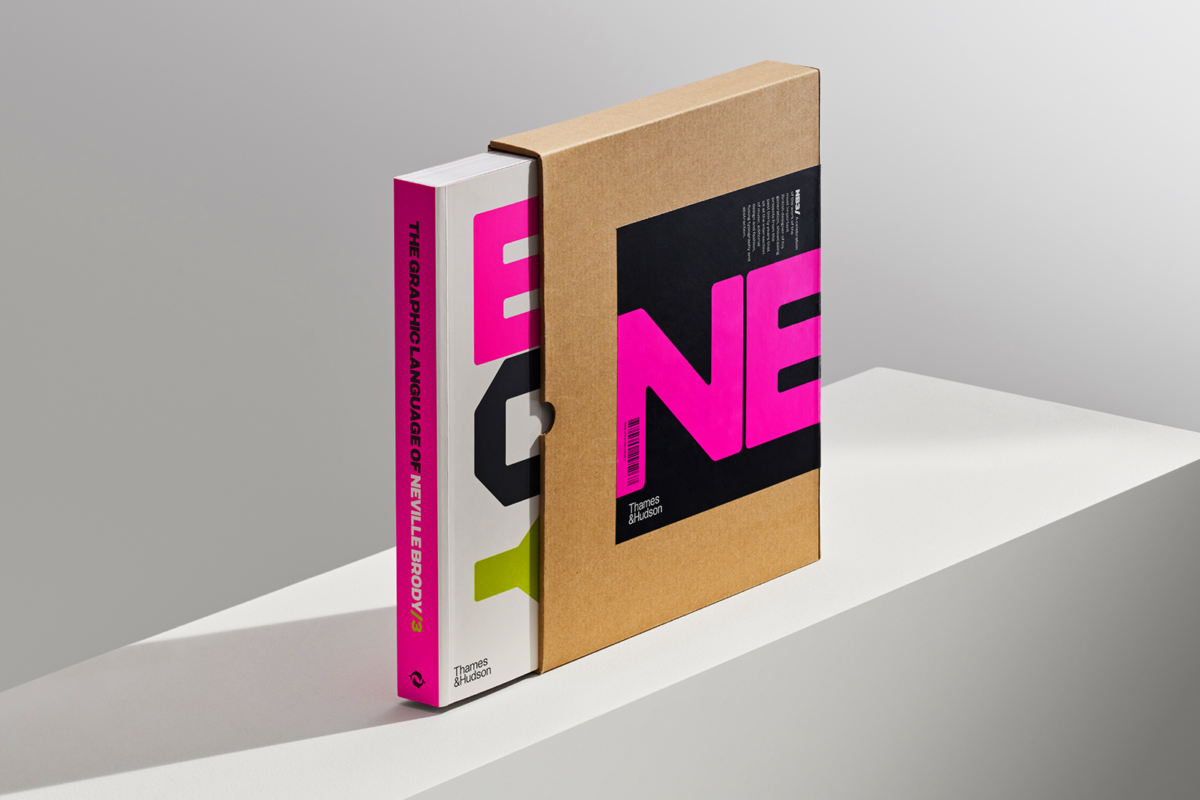
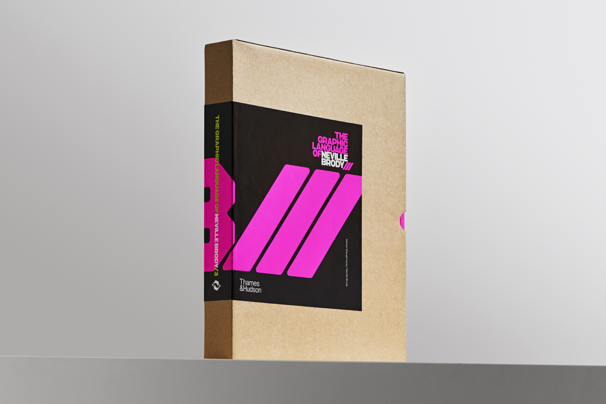
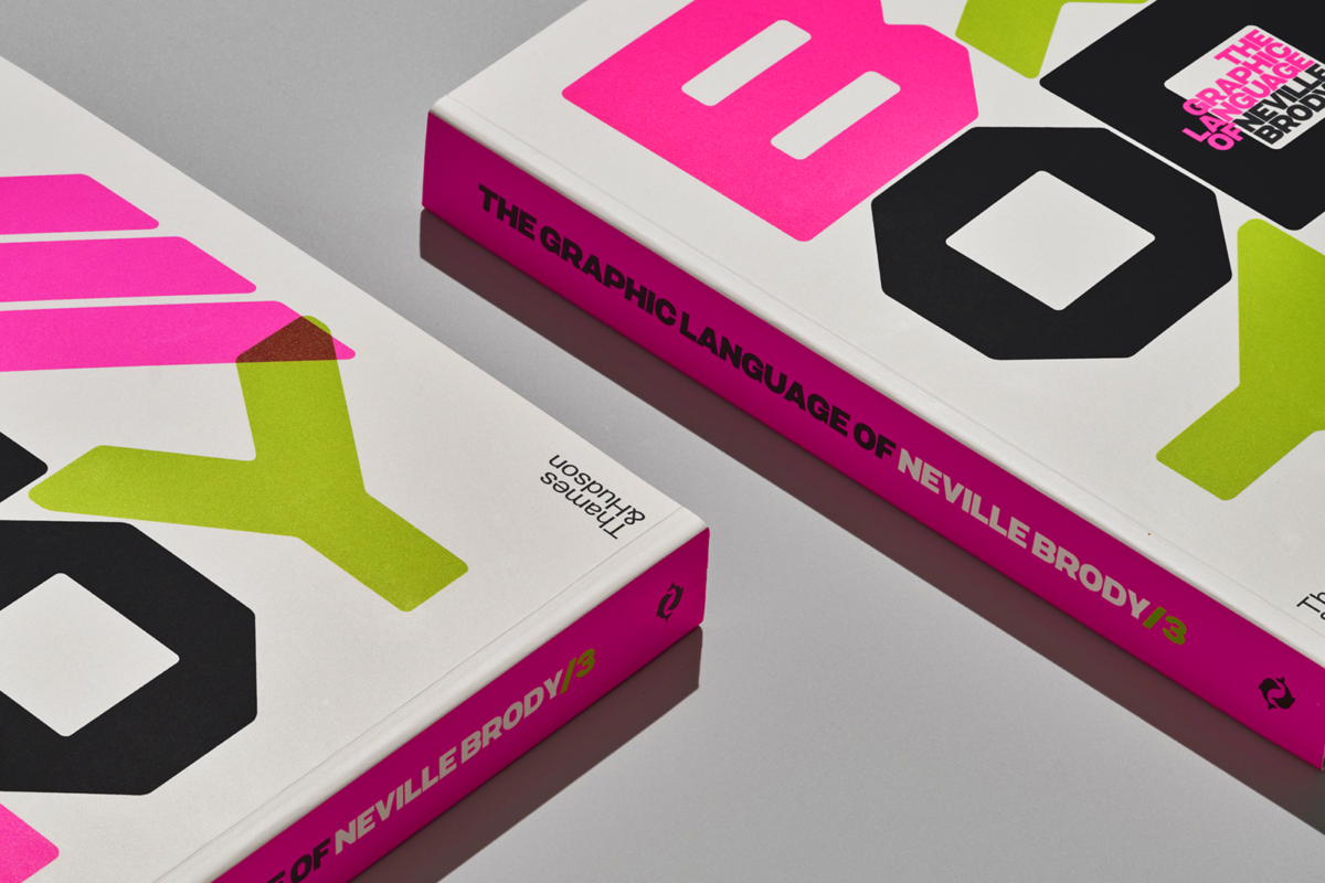
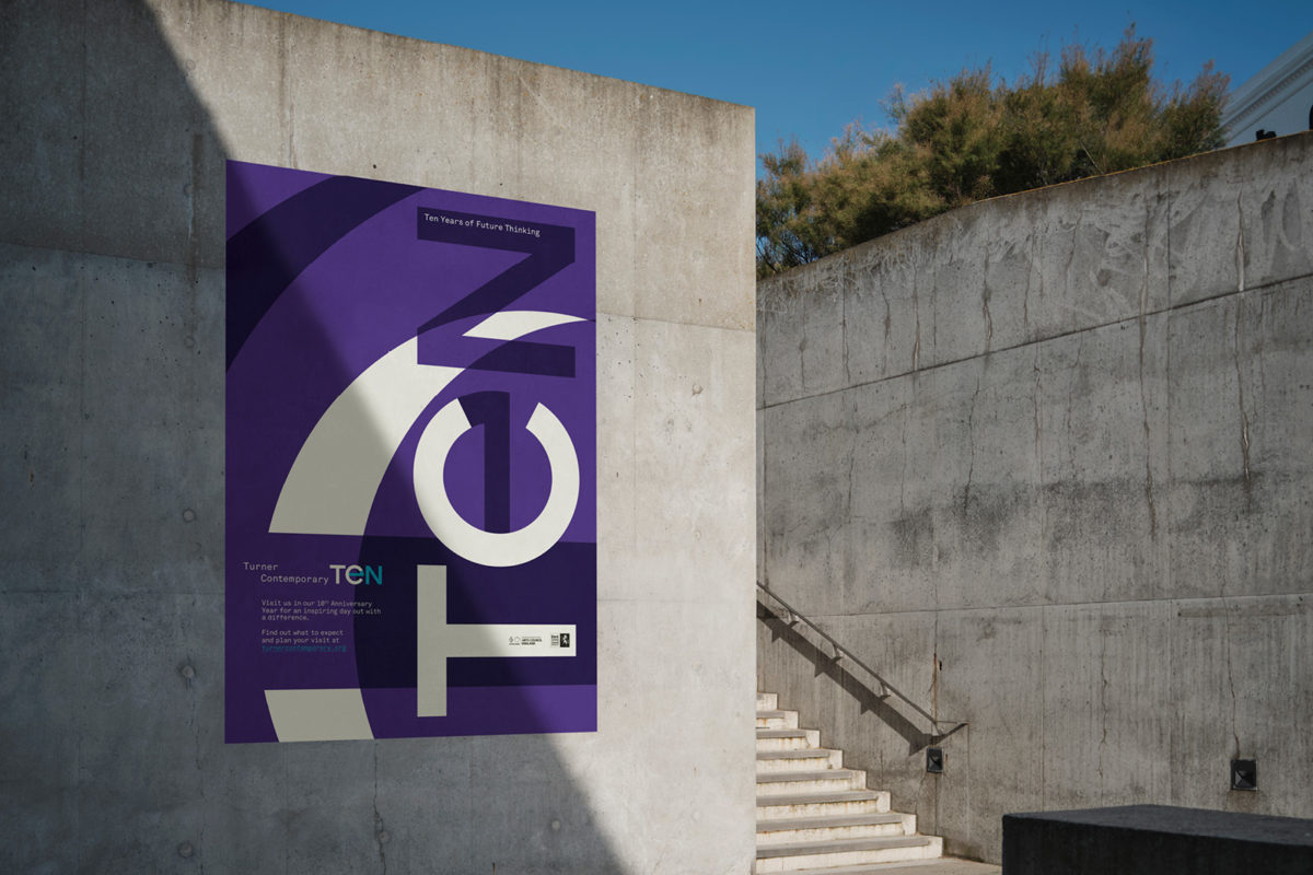
네빌 브로디는 ‘시각적 언어’의 동의어입니다. 독창적인 크리에이티브 디렉터, 디자이너, 타이포그래퍼이자 브랜드 전략가로서, 그는40여년에 걸쳐 내놓은 작업들로 세계적인 호평을 받고 있습니다. 그는 디자인의 경계를 넓히고 혁신적인 시도를 하는 것으로 잘 알려져 있으며,이러한 탐구 정신과 우수성에 대한 추구는 우리 에이전시의 접근 방식을 보여줍니다.

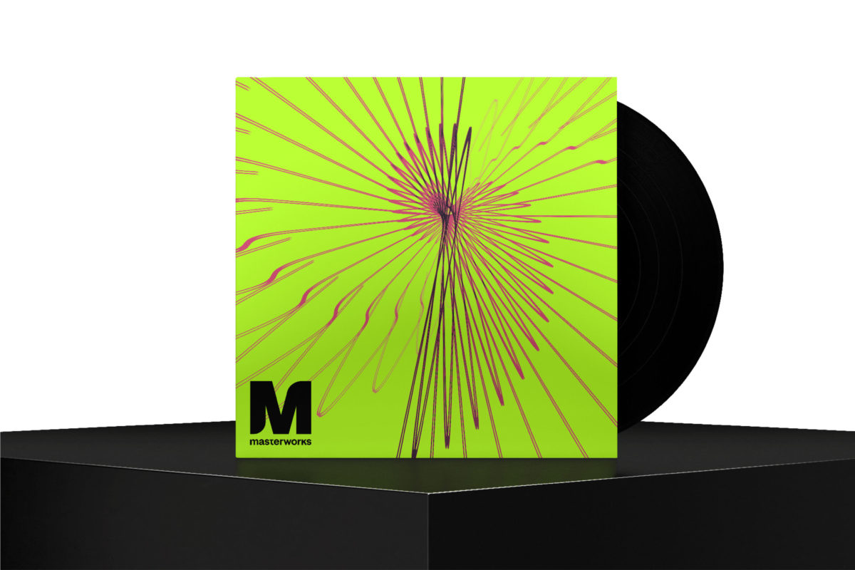
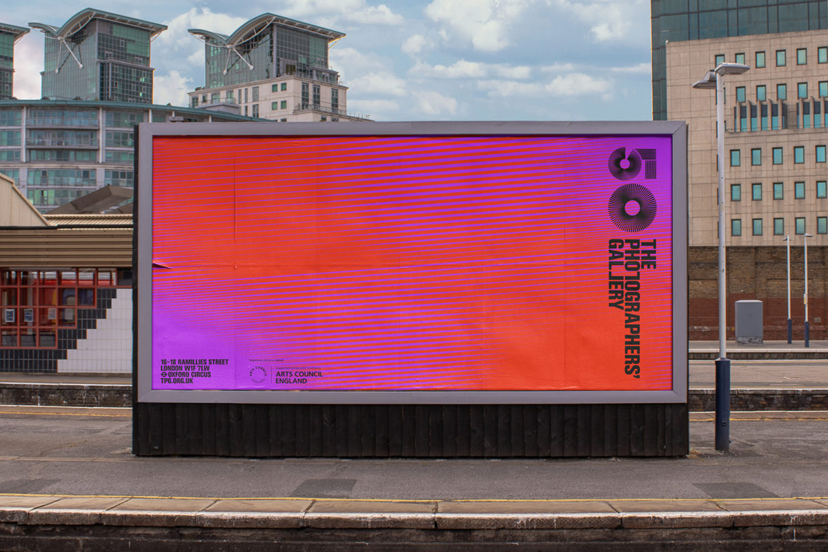
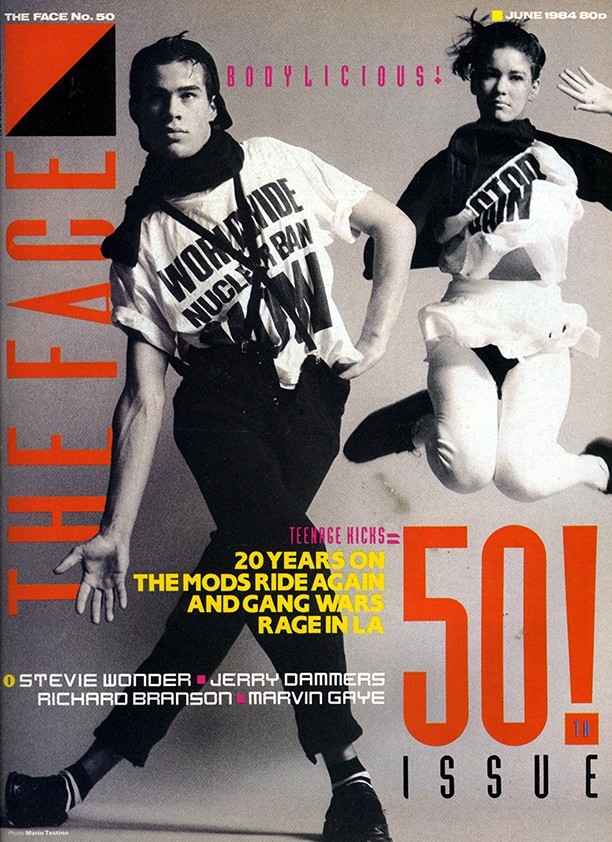
그는 항상 실천적인 크리에이티브 디렉터이자 디자이너였습니다. 1970년대 후반, London College of Printing (현재 London College of Communication)을 졸업한 후에는 펑크 밴드를 위한 아이코닉한 앨범의 슬리브 디자인을 만들어 주목을 받게 되었고, 이후 1980년대에 The Face 와 Arena에서 아트 디렉터로 활동하며 국제적인 명성을 얻게 되었습니다. 1990년대 후반부터, 브로디는 BBC, The Times, Somerset House, Royal College of Art, Tate, Channel 4 등 영국에서 가장 저명한 예술 및 문화 브랜드들을 위한 시대의 획을 긋는 작업들을 제작해왔습니다.

TheFace.1.jpg#asset:539

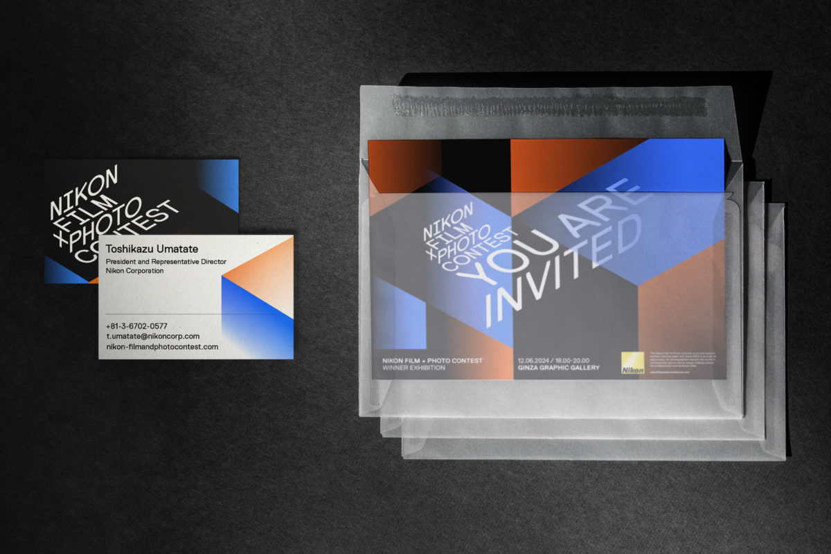
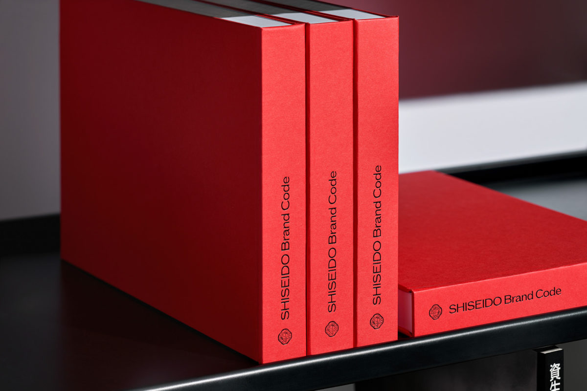
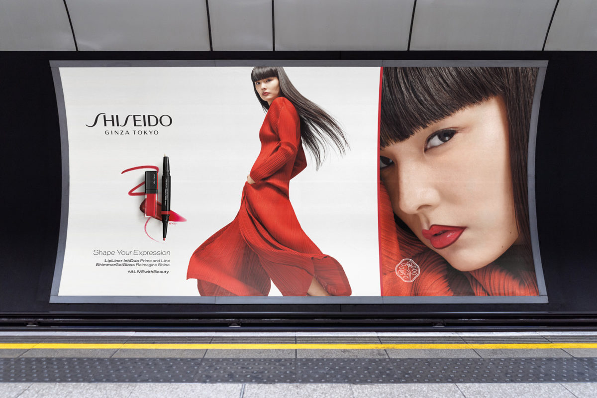
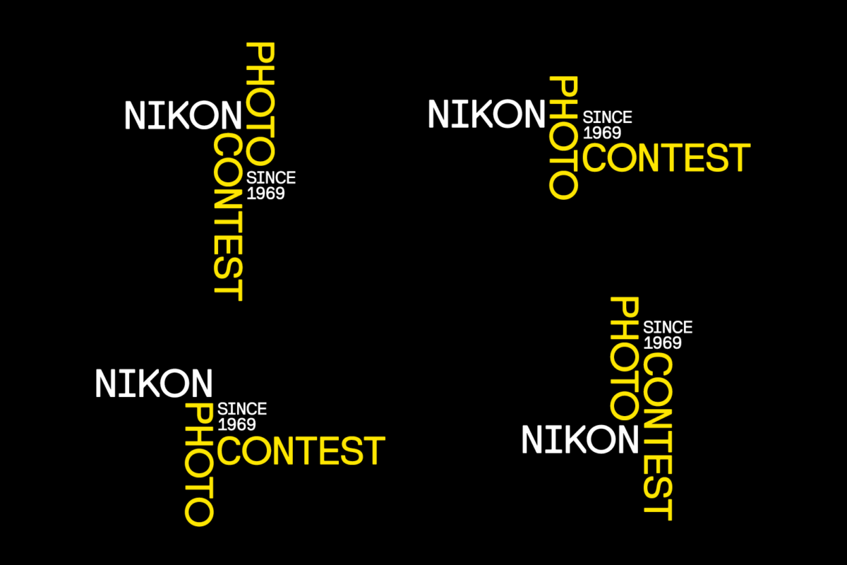
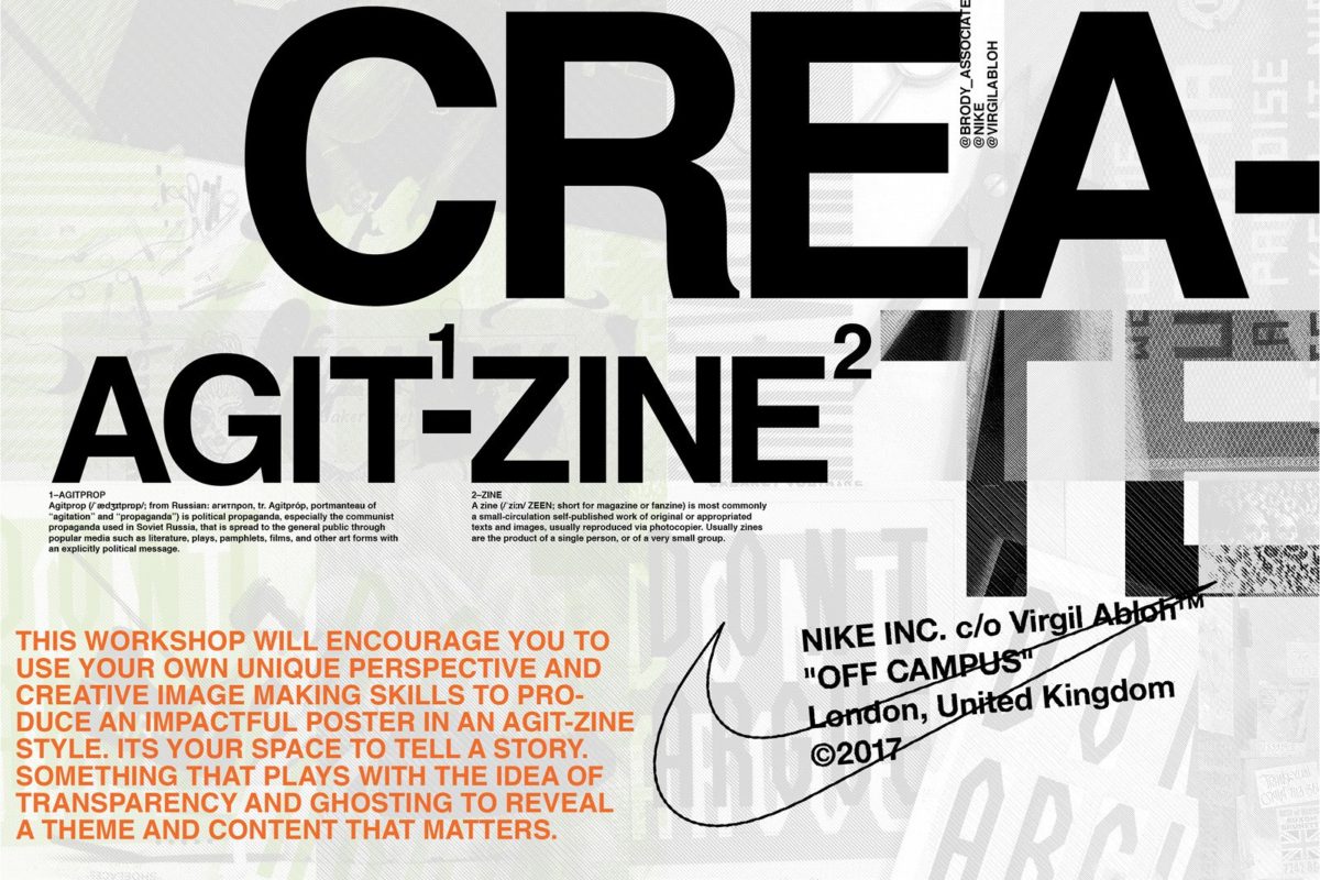
이제 그는 Brody Associates의 팀을 이끌며, 컨셉트 설정부터 완성에 이르기까지 프로젝트에 열성적으로 참여하고 있습니다. 영국 브랜드 및 비즈니스와 긴밀한 유대 관계를 유지하고 있을 뿐만 아니라, Samsung, Yamaha, LVMH, GAP, Uniqlo, The Coca-Cola Company, Nike, NIKON 등 글로벌 대기업과도 함께 작업하고 있습니다.

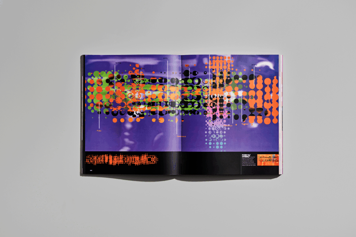
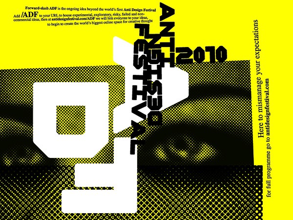
브로디는 자신의 작업물과 새로운 모험에 대한 전파를 통해, 창의성에 대한 인식에 적극적으로 도전합니다. 1991년, 타이포그래피에 대한 그의 열정은 가장 급진적이고 실험적인 예술 형식을 공유 및 축하하는 출판물인 FUSE를 탄생시켰습니다. 또한, 2011년 런던에서 열린Anti-Design Festival (ADF)을 주최하여, 디자인 분야의 새로운 아이디어와 미디어를 탐색하고 현대적인 디자인 환경에 도전했습니다.

ADF.jpg#asset:515

이러한 디자인에 대한 많은 기여는 2011년 Royal Designer for Industry (RDI), 영국 최고의 디자인상, 2010년 Prince Philip Designers Prize의 특별 표창 등 많은 산업 단체와 조직에 의해 인정되었습니다. 전 세계 갤러리, 박물관과 도서관에서 소장하고 있는 Brody의 작품 중에서도 1991년에 디자인된 서체 Blur는 New York’s Museum of Modern Art에서 상설 컬렉션의 일부로 전시되어 있습니다.

브로디는 창의적 교육에 관해서도 마찬가지로 열정을 가지고 있으며, 현재 런던 Royal College of Art의 Visual Communication교수로 재직 중입니다. 또한, 2012~2013학년도에는 Design and Art Direction (D & AD UK) 회장으로 임명되어, 창의적 교육 분야가 직면한 미래의 과제에 대한 세계적인 인식을 높이고, 산업 지원과 변화의 필요성을 옹호했습니다. 그는 계속해서 국제적으로 강의하고 업계의 대변인으로 활동하면서, 디자인 교육을 지원하고 차세대 기회를 홍보하고 있습니다.

Neville_Signature_3.png#asset:521

그에게 있어 모든 디자인의 사고와 절차는 결과만큼이나 매력적이고 중요하며, 이것이 그가 에이전시에서 계속해서 적용하고 독려하는 철학입니다.

Brody Associates 소개

Brody Associates는 런던을 기반으로 한 디자인 스튜디오로, 모든 플랫폼에서의 아이덴티티, 타이포그래피, 크리에이티브 디렉션을 전문으로 다루고 있습니다. 2014년 네빌 브로디가 설립한 이래, 세계 저명 브랜드, 유명 기관 및 혁신적인 스타트업 기업들과 협력해오고 있습니다.

우리의 접근방식은, 숙련되고, 지식에 기반하며, 전략적이고 매우 창의적입니다. 고객과 디자이너 간의 직접적인 협력관계는, 우리 팀들이 프로젝트의 시작부터 끝까지 깊이 이해하고 참여할 수 있도록 해줍니다.

각 의뢰는 스튜디오 내의 프로젝트 관리, 행정 , 고객 지원을 통해 보완하여 정확한 시간과 예산 준수를 보장합니다. 우리는 프로젝트의 성격과 내용에 따라 신중하게 선택된, 민첩하고, 확장가능한 팀을 구성합니다. 이러한 팀들은 각자의 분야에서 전문 지식을 제공하는, 매력적이고, 숙련되었으며, 창의적이고, 열정적인 개인들로, 우리의 가족입니다. 우리는 경험을 통해 고객이 이러한 접근 방식을 좋아하고, 이를 통해 좋은 결과를 가져올 수 있다는 것을 알고 있습니다.

This page was automatically translated according to your browser language settings.

Acknowledge
Read in English