Typeset in Calvert Brody created for the Royal College of Art. © 2012 by Margaret Calvert, Neville Brody & Henrik Kubel.

Brody Associates is a London-based design studio specializing in identity, typography, and creative direction across all platforms. Founded by Neville Brody in 2014, we collaborate with the world’s biggest brands, celebrated institutions, and dynamic start-ups.

Inspired by the company’s archive, Brody Associates’ type design strategy blended Coca-Cola’s rich font heritage with its modern-day use requirements, bringing another layer of storytelling to the brand through typography. “Better with…” comes in both a wide and narrow style. Used together they bring unique personality, movement, and playfulness to marketing and communications during the 2023 holiday season.

Client: Coca-Cola
Project: “Better With…” Typeface (Holidays 23 Edition)
Specialism: typography
Credits: © 2023 The Coca-Cola Company
1/8

The Graphic Language of Neville Brody 3 (NB3) is available online and through selected retailers. Written and edited by Neville with Adrian Shaughnessy, the book includes a foreword by Steve Heller and additional text by Naomi Hirabayashi and Jo-Ann Furniss.
Click HERE to receive a 30% discount using the code NB330 or visit: t.ly/NB3

Client: Neville Brody
Project: NB3
Specialism: The Graphic Language of Neville Brody 3
Credits: Images: Nick Rochowski, 2023
1/10

Sony Music Masterworks wanted its new brand identity to be able to “perform”. Covering a diverse range of classical, jazz, show, and experimental music genres, the brand was rapidly expanding into live performance, events, and experiences, where the new identity needed to come alive. We created logotypes, marks, a typeface, and a full BI system that embraced both static and animative states and was suitable for all touchpoints.

Client: Sony Music Masterworks™
Project: Sony Music Masterworks Brand and Motion
Specialism: brand identity, typography, and creative direction
Credits: © 2023 Sony Music Entertainment
1/11

Inspired by the golden age of Americana type and in the playful spirit of the original 1940s Baskin Robbins experience, Brody Associates created BRK Sans, a modern, playful, and “creamy” typeface for the company’s South Korean franchise. A versatile single style and multiple weights were created to bring expression across all of the brand’s touchpoints.

Client: SPC
Project: BKR Sans
Specialism: typography
Credits: Paris Croissant Co., Ltd.
1/10

Founded in 1971 as Britain’s first public gallery dedicated to photography, The Photographers’ Gallery (TPG) wanted an engaging campaign identity for its 50th anniversary. TPG 50 locked together a celebratory moiré effect stamp which worked alongside the existing identity and broke out into its own graphic language to tie together platforms, experiences, and events.

Client: The Photographers’ Gallery
Project: TPG 50
Specialism: campaign identity and typography
Credits: The Photographers’ Gallery – Registered Charity Number: 262548
1/8

Union Square & Co., part of America’s Barnes & Noble, publishes a diverse collection of genres – from fiction and food titles to mindfulness and children’s books. Brody Associates created a central brand identity, visual language system and a new typeface family to bring consistency to this variety of imprints. The toolkit and application systems enabled the brand to scale iconically across touchpoints.

Client: Sterling Publishing Co., Inc.
Project: Union Square & Co. and Union Square & Co. Kids
Specialism: brand identity, typography, and creative direction
Credits: Union Square & Co., LLC.
1/11

American’s number 1 hospital. Mayo Clinic needed a Global Visual Language that worked across its brandscape, platforms, and touchpoints as one consistent joined-up experience. Brody Associates created a next-generation comprehensive brand manual bringing clear strategy, governance, principles, consistency, and scalability to engage audiences.

Client: Mayo Clinic
Project: Mayo Clinic Visual Brand Guidelines
Specialism: Brand identity and creative direction
Credits: Mayo Clinic ©2021 All Rights Reserved
1/9

L’Occitane En Provence commissioned Brody Associates to create a new typeface for use across platforms. Celebrating the spirit of the brand’s duality, L’Occitane En Provence Serif and Sans bring together juxtapositions of handmade and industrial; rural and urban; functional and flamboyant. The typeface is available in a range of weights and styles.

Client: L’Occitane En Provence
Project: L’Occitane Serif and L’Occitane Sans Typeface
Specialism: typography
Credits: L’Occitane International SA ©2021 All Rights Reserved
1/11

Embracing a provenance since 1832 and with a direct lineage to the company’s rich typographic history, Brody Associates created LONGINES Sans and Serif a new typeface family for the luxury Swiss watchmaker. A versatile set of styles and weights, optimised for both headline and text across all the brands’ touch-points.

Client: Longines
Project: Longines Serif and Longines Sans Typeface
Specialism: typography and creative direction
Credits: © 2021 Compagnie des Montres Longines Francillon SA All rights reserved.
1/12

TC TEN celebrates 10 years of future thinking for the now iconic Turner Contemporary in Margate (UK). Brody Associates created the anniversary identity which brings together the institutions initials and anniversary into a bespoke wordmark to connect with the existing brand identity in a vibrant, playful and scalable way.

Client: Turner Contemporary
Project: TC TEN (10th Anniversary)
Specialism: brand identity, typography and creative direction
Credits: Turner Contemporary
1/7

For the first time in their 150-year history, SHISEIDO, the iconic Japanese skincare, make-up, and fragrance brand, decided to commission a company-wide unifying communication strategy. Brody Associates was entrusted to develop and build the global organization’s first brand code, one that aligned its strategy and narrative with its creative and application principles across product lines, territories, and platforms.

Client: SHISEIDO
Project: SHISEIDO Brand Code
Specialism: brand identity and creative direction
Credits: SHISEIDO Co., Ltd.
1/8

Tokyo Verdy, the most successful team in Japanese football history, asked Brody Associates to help deliver its vision for the future through the creation of a new brand identity, typeface, and visual language. Together, these celebrated the brand’s heritage and enabled its future growth as a business, incorporating other sports and activities.

Client: Tokyo Verdy
Project: Tokyo Verdy Brand Identity
Specialism: brand identity, typography, and creative direction
Credits: Amadana Sports Entertainment Corp.
1/9

Brody Associates was commissioned by ASICS to overhaul its Onitsuka Tiger logotype. The main goal was to ensure that the logotype remained recognizable while refining it for greater aesthetic appeal and to work more successfully across different environments and platforms.

Client: ASICS
Project: Onitsuka Tiger Logo Refinement
Specialism: typography
Credits: ASICS Corporation/Drill Inc.
1/6

Seemingly simple, Brody Associates’ evolved marque for Christian Dior was created to retain its iconic characteristics and prestige positioning yet make it a highly practical object in application. We created it as a connected design with an interchangeable vertical axis, allowing it to be used as a single piece stamp or component.

Client: LVMH
Project: Christian Dior Marque
Specialism: brand identity and typography
Credits: LVMH
1/5

Connecting Samsung as a single experience across all of its platforms, products, and territories is a challenge. Samsung commissioned Brody Associates to design and creatively direct the SamsungOne typeface family. It functions distinctively at any scale in any environment and covers more than 400 languages and 26 writing systems.

Client: Samsung Electronics
Project: SamsungOne Typeface
Specialism: Typography and creative direction
Credits: Samsung Electronics Co., Ltd.
1/7

Revisiting Neville Brody’s typographic archive, Brody Associates created new slogans, calls to action, and graphic logos for a capsule collection for Supreme.

Client: Supreme
Project: Nevile Brody for Supreme
Specialism: Typography and creative direction
Credits: Supreme

Revisiting Neville Brody’s typographic archive, Brody Associates created new slogans, calls to action, and graphic logos for a capsule collection for Supreme.

Client: Supreme
Project: Nevile Brody for Supreme
Specialism: Typography and creative direction
Credits: Supreme
1/6

SPC came to Brody Associates to bring a more contemporary sense of playfulness and movement across their Dunkin’ Donuts franchise touchpoints, from packaging and in-store to digital platforms. The resulting creative direction dynamically combined scaled type, bold forms, patterns, color, and motion.

Client: SPC
Project: Dunkin’ Donuts Graphics
Specialism: creative direction
Credits: Paris Croissant Co., Ltd.
1/8

Mayo Clinic is one of the most recognized and respected healthcare, medical research, and educational institutions in the USA. Brody Associates was asked to create a bespoke typeface, Mayo Clinic, across display, serif, and sans serif font styles as part of the brand development process. This led into the adaptation of core brand identity elements.

Client: Mayo Clinic
Project: Brand Identity Refinement and Mayo Clinic Typeface
Specialism: Brand identity, typography, and creative direction
Credits: Mayo Clinic
1/10

Channel 4 asked Brody Associates to create Horseferry, a highly distinctive display typeface that would become recognizable as a key part of the renewed identity across all its channels and content. Complementing this, we also developed Chadwick, a highly functional typeface, as its informational counterpart.

Client: Channel 4
Project: Chadwick and Horseferry Typefaces
Specialism: Typography
Credits: Channel Four Television Corporation
1/8

Opening a campus in White City, London, the RCA asked Brody Associates to create a signage system that would mark its arrival in this new venue, creating a prominent spatial identity and presence. To achieve this, we used scale and a bespoke typeface, Calvert Brody, a remix collaboration between Neville Brody and renowned designer and typographer Margaret Calvert.

Client: Royal College of Art (RCA)
Project: White City Environment Branding
Specialism: Typography and creative direction
Credits: Royal College of Art
1/7

Brody Associates created a brand identity and visual language for the Nikon Photo Contest that used perpendicular angles to bring dynamism and energy to one of the world’s most influential photo competitions. The use of iconic elements, like Nikon yellow, allowed us to create links between the contest identity and corporate presence.

Client: Nikon
Project: Nikon Photo Contest Brand Identity
Specialism: Brand identity and creative direction
Credits: Nikon Corporation/Plus Eight One
1/5

In designing Vandals, the underground radical and experimental magazine, Brody Associates explored new forms of creative direction and layout, and relationships between type and image. Combining this with editorial content makes Vandals not only a publication but also a unique and provocative artifact.

Client: Vandals
Project: Vandals Magazine
Specialism: Creative Direction
Credits: WE ARE VANDALS
1/8

To celebrate 180 years since its Royal Charter, the RCA asked Brody Associates to build a scalable and dynamic typographic brand identity to work distinctively across all platforms.

Client: Royal College of Art (RCA)
Project: RCA 180 Anniversary Identity
Specialism: brand identity and typography
Credits: Royal College of Art
1/6

Paris Baguette, South Korean conglomerate SPC’s biggest FMCG franchise brand, had reached maturity in its home market and was expanding rapidly internationally. Brody Associates was commissioned to develop a new brand identity, bespoke typeface, PB Signature, and creatively direct the new cross-platform visual language.

Client: SPC
Project: Paris Baguette Brand Identity
Specialism: brand identity, typography, and creative direction
Credits: Paris Croissant Co., Ltd.
1/9

Brody Associates created The Coca-Cola Company’s first ever proprietary typeface, now applied to brand and corporation. Alongside its highly functional aspects, we based the personality of TCCC Unity on type characteristics that surfaced as part of our extensive archival research.

Client: The Coca-Cola Company
Project: TCCC Unity Typeface
Specialism: Typography
Credits: The Coca-Cola Company
1/7

Brody Associates was given the unique honour by Nike Football of designing the typeface for the 2014 FIFA England World Cup kit. England Brody consisted of display numerals and functional alphabetic characters, bringing personality and performance, first to the men’s kit and then to the women’s and under-21s’.

Client: Nike
Project: England Brody Typeface
Specialism: Typography
Credits: Nike, Inc.
1/6

As part of the launch of their first “The Ten” collection, Nike and Virgil Abloh asked Brody Associates to creatively direct and deliver a workshop for their “OFF CAMPUS” event in London. We focused on working with young creatives to reinvent the fanzine for modern times, introducing them to skills they had not encountered before.

Client: Nike
Project: Nike c/o Virgil Abloh “OFF CAMPUS” London
Specialism: Creative direction
Credits: Nike, Inc.
1/6

Aligning with Tate Modern’s core concepts of experimental performance and live engagement, Brody Associates creatively directed a book and companion AI app to bring the performative dimension of the content to life. We designed Buffalo Mono, a typeface which was featured as part of the visual language.

Client: Tate Public Programmes
Project: BMW Tate Live: Perform, Experience, Re-Live
Specialism: Typography and creative direction
Credits: Tate Modern
1/8

Brody Associates was asked to rationalize, modernize, and simplify Dom Pérignon’s core brand identity and visual language for this prestigious champagne house’s vintage offering. Alongside this, we initiated and created a completely new packaging system that functioned both for self-display in-store and as a luxury case.

Client: LVMH
Project: Dom Pérignon Vintage Brand Identity Development and Packaging
Specialism: Brand identity and creative direction
Credits: LVMH
1/3

Samsung came to Brody Associates to overhaul the icon language across its Domestic Appliance division. We created a visual lexicon based around the words used to describe various brand elements. We then translated that into a compelling design system for optimum performance in print and digital environments, and our guidelines ensured the system was future-proofed.

Client: Samsung
Project: Samsung Icons
Specialism: brand identity
Credits: Samsung Electronics Co., Ltd.
1/5

Balfron Tower is an iconic brutalist building in East London designed by Ernő Goldfinger. As part of its redevelopment by Londonewcastle, Brody Associates was asked to create the brand identity, typeface Balfron Modern, visual language, and creatively direct the project to reflect the building’s heritage qualities in a contemporary way.

Client: Londonewcastle
Project: Balfron Tower Brand Identity
Specialism: Brand Identity, Typography, and Creative Direction
Credits: Balfron Tower Development LLP c/o Londonewcastle
1/8

The South Korean FMGC conglomerate SPC asked Brody Associates to overhaul and elevate the brand identity of their existing Coffee@Works concept. We created a dynamic and modern identity based on letterpress expertise, and creatively directed the supporting visual language.

Client: SPC
Project: Coffee@Works Identity
Specialism: brand identity and creative direction
Credits: Paris Croissant Co., Ltd.
1/6

For more information about Brody Associates, click here.

If you would like to get in touch, please contact us at:

hello@brody-associates.com +44 (0) 207 704 2445

Neville Brody

Neville Brody is synonymous with ‘visual language’. A seminal designer, typographer, and brand strategist, he is acclaimed globally for a body of work that spans more than four decades, and he is renowned for experimentation and pushing creative boundaries in all aspects of his practice.

This spirit of exploration and the pursuit of excellence inform the approach of Brody Associates, the collaborative creative agency he founded in 2014. Brody Associates specializes in identity, typography, and cross-platform visual-language systems working across all touchpoints, from print to pixel to physical.

Brody’s prolific contribution to design has been widely acknowledged, including his investiture in 2011 as a Royal Designer for Industry, the UK’s highest design accolade, and a Special Commendation in the Prince Philip Designers Prize in 2010. His work is held in permanent collections in the UK and internationally. The typeface Blur (designed in 1991) is in the permanent collection of the Museum of Modern Art (New York), and numerous design works are held in the V&A Museum (London), Design Museum (London), M+ (Hong Kong), and Museum für Gestaltung Zürich.

TheFace.1.jpg#asset:539

Brody is passionate about creative education and was Dean of the School of Communication at London’s Royal College of Art from 2011 to 2018, where he continues as Professor of Communication. He used his term as President of Design and Art Direction at D&AD (2012–2013) to raise global awareness of the challenging future facing creative education. And he continues to champion the needs for development, diversity, representation, and change.

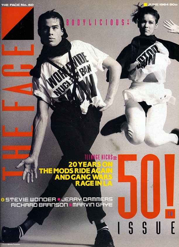
Despite such commitments, Brody remains hands-on as a designer. He came to prominence early in his career. After graduating from the London College of Printing (now London College of Communication) in the late 1970s, he worked on album sleeves for industrial, punk, and experimental new wave bands, both as a freelancer and at Rocking Russian and Stiff Records. His consequent work as art director of magazines such as The Face and Arena in the 1980s won him international fame.

Though his portfolio includes work for British clients – identities for Somerset House and the Royal College of Art; design systems for The Times and BBC online; typography commissioned by Nike Football for the 2014 England World Cup kits; and the main typeface designs for Channel 4 – since the 1990s, the bulk of his work is for brands and organisations based outside the UK.

Alongside fashion brands, such as Supreme, Issey Miyake, Masha Ma, and independent publication Vandals, he currently works with global blue-chip companies like Shiseido, Samsung, and Nikon in Asia; Christian Dior and Longines in Europe; and Mayo Clinic, Barnes and Noble Group, and Sony Music Masterworks in the USA. With his team, he’s responsible for The Coca-Cola Company’s global typeface, TCCC Unity, the brand’s first proprietary font in 150 years.

Brody actively challenges perceptions of creativity through his work, but also through the propagation of new ideas. In 1991, for example, his deep curiosity and understanding of typography led to FUSE, a publication exploring and sharing radically innovative and experimental approaches to typography. He set up FUSE with Jon Wozencroft, who also collaborated on volumes one and two of The Graphic Language of Neville Brody, published in 1988 and 1994 respectively. To celebrate the 20th edition, publisher Taschen released a compendium of all FUSE issues.

ADF.jpg#asset:515

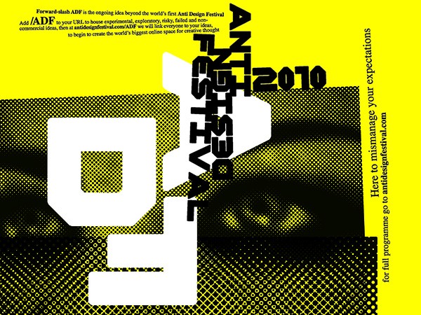
The Anti-Design Festival, staged in Shoreditch, London, in 2011, explored unconventional ideas and new forms across design and art. Set up by Brody to challenge the contemporary designscape where risk-taking can be taboo and experimentation often seen as failure, the show neatly summed up Brody’s approach. For him the thinking and the process behind any design are as engaging and important and the outcome and impact.

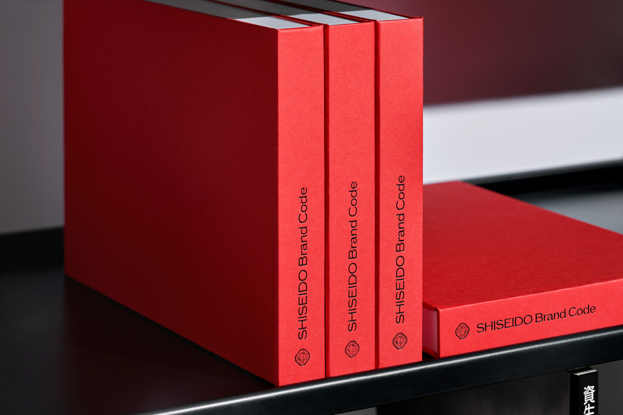
Most recently, Brody and his team have been working on a range of global projects and collaborations. Over the last few years, they have created the Brand Code and Guidelines for Shiseido, the first in the Japanese brand’s 150-year history; a typeface family for L’Occitane en Provence; new identities, global fonts, and design systems for Coca-Cola; celebration identities for Turner Contemporary (UK) and The Photographers’ Gallery (UK); motion and movement identity development work for Sony Music Masterworks; and brand design systems and fonts for Mayo Clinic.

In 2023, typography created by Brody featured on the new football kit worn by the England women’s national team at the World Cup. While his hotly awaited new publication, The Graphic Language of Neville Brody 3 (NB3), was launched in partnership with Thames and Hudson.

Neville_Signature_3.png#asset:521

Creatively or commercially, Brody has always been seen as an enduring and dualistic influence within the global creative community. A creator and cultural commentator highly respected for his iconic work as well as his current commissions, he continues to explore and interrogate different platforms and media. Whether collaborating with his studio or as an individual designer, at home and around the world, Brody remains both a polymath and a protagonist.

Brody Associates

Our approach is skilled, knowledge-based, strategic, and highly creative. A direct working relationship between client and designers ensures our associate teams are deeply engaged with a project from appointment to completion.

Each commission is complemented by in-house project management, administration, and client support to ensure timeframe precision and budget adherence. We bring together carefully selected, agile, and scalable teams according to the nature and ambitions of the commission. These teams are our family of personable, skilled, creative, and passionate individuals, who bring expertise in their respective fields. We find our clients like to work in this way and understand that this produces great outcomes.

This page was automatically translated according to your browser language settings.

Acknowledge
Read in English